
Printer Color Calibration for Crafters: Save Ink With Pattern Prints
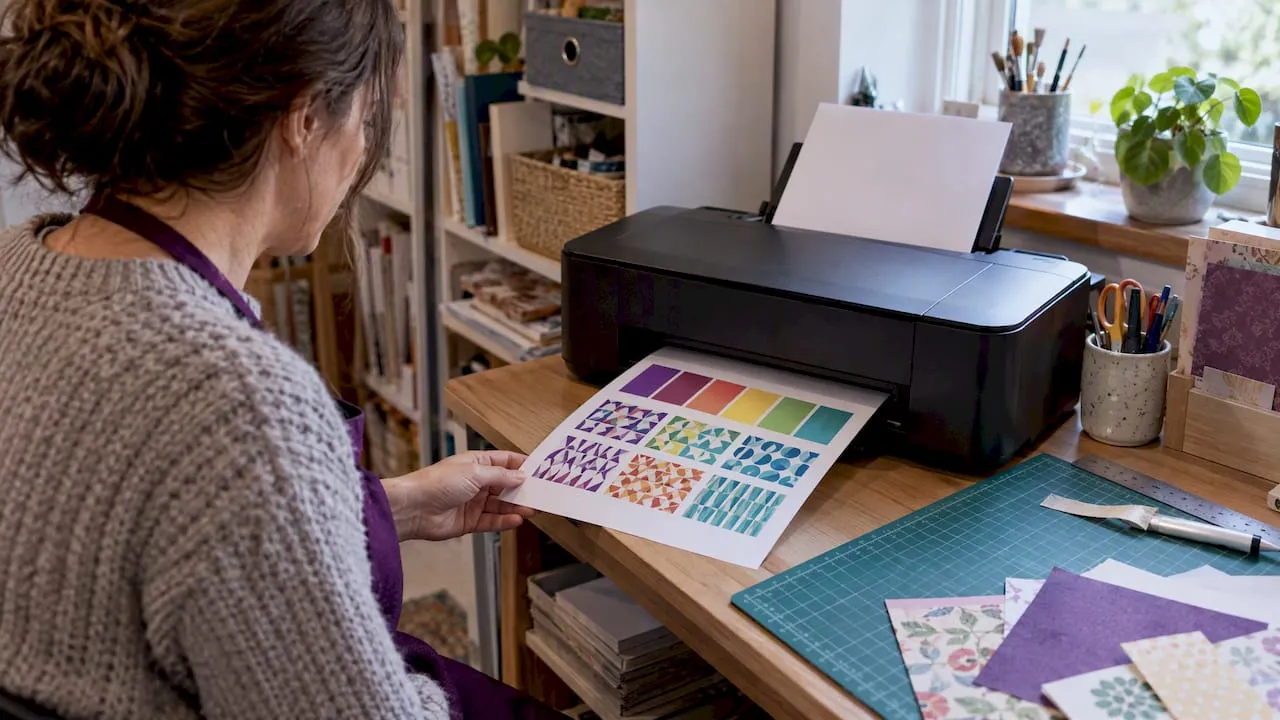
Use a consistent colour-managed workflow: calibrate your display, apply the matching ICC or AM1X profile for your paper, let the application rather than the driver handle colour, then calibrate the printer itself. Follow these steps in order and check your results at each stage, and your prints will match what you see on screen far more reliably.
TL;DR:
- Use a hardware colorimeter rather than your eyes, aim for about 120 cd/m² and D65, and recalibrate monthly under steady room lighting.
- Match the profile to the exact paper, finish, printer, and media setting; unusual or textured stock may require a custom profile.
- Set the editing application to manage color, disable driver adjustments, and select the matching media type to prevent muddy or oversaturated output.
- Use perceptual rendering for flat, saturated craft graphics and relative colorimetric for photographs, then make a small physical proof before using costly stock.
- Linearize the printer before building a custom profile, and rebuild or verify that profile after changing paper, ink, printhead, or cartridge type.
Table of Contents
- The colour-managed workflow checklist
- How to calibrate and profile your monitor for print work
- Choosing paper and installing ICC or AM1X profiles
- Install drivers and set colour management correctly
- Soft proofing and economical hard proofs
- Printer calibration and profiling explained
- Verification, maintenance and scheduling
- Troubleshooting checklist for common colour problems
- Creating a custom ICC profile for your printer, paper and ink
- Understanding colour gamuts and printer colour spaces for craft printing
- How ink type affects colour calibration and print results
- Troubleshooting colour calibration for card making and craft projects
- Calibrating for layered and mixed media craft projects
- Digital craft designs versus photographic prints: what changes
- Practical perspective: calibration tips for small-batch crafters
- Print-ready craft downloads from Craftsuprint
- FAQ
- Sources
The colour-managed workflow checklist
Treat printer colour calibration as a sequence rather than a single fix. Most steps are one-off setup tasks; a few needs repeating as paper, ink or lighting conditions change.
- Calibrate your monitor and set a stable viewing environment (recurring, roughly monthly).
- Pick your paper and install its matching ICC or AM1X profile (one-off per paper type).
- Install drivers and set the application, not the driver, to manage colour (one-off per device).
- Soft proof the file and run a small hard proof before committing a full sheet (every new job).
- Calibrate or linearise the printer itself (one-off setup, repeated after major changes).
- Verify output against your proof and recheck periodically (ongoing).
Skipping the proofing step is the single most common reason crafters waste paper and ink on prints that looked fine on screen.
How to calibrate and profile your monitor for print work
Screens emit light and printers reflect it, which is why a vivid on-screen image can look flat or shifted once printed, as PCMag explains. Getting your monitor right is the foundation everything else builds on.
- A hardware colourimeter (such as those from Datacolor or X-Rite) gives a far more reliable calibration than relying on your eyes and the operating system’s built-in wizard.
- A spectrophotometer adds spectral measurement, useful if you also plan to build custom printer profiles later.
- Built-in OS calibration tools are workable for casual printing but lack the precision needed for colour-critical photo or art work.
- Aim for a starting brightness around 120 cd/m² and a D65 white point, then adjust lighting in your workspace to a consistent, moderate level rather than bright daylight or warm lamps.
Once your monitor is calibrated, soft-proofing becomes meaningful: what you see on screen starts to approximate what will come off the printer.
Pro Tip: Recalibrate your monitor on a fixed schedule rather than waiting for colours to look “off”, since drift happens gradually and is easy to miss day to day.
Choosing paper and installing ICC or AM1X profiles
Paper is not a neutral surface. Its white point, coating and finish all shift how ink sits and how colour reads, which is why a profile made for one paper rarely works on another, even from the same manufacturer.
- Always match the profile exactly to the paper stock, finish and printer model you are using; a close substitute is not a safe substitute.
- A standard ICC profile defines colour behaviour only, while enhanced packages such as Epson’s Media Installer bundle the ICC with mechanical settings, like paper thickness handling, that the printer needs for that specific stock.
- Global Vision’s glossary notes that custom-built profiles are considered the gold standard for specialised or unusual media where off-the-shelf profiles do not exist.
- Build a custom profile when working with uncoated, textured or craft-specific papers that fall outside the manufacturer’s standard profile list, something common in card making and mixed media work.
For more on how finish affects results, our guide to matte versus glossy paper covers which finish suits different craft projects.
Install drivers and set colour management correctly
The most frequent cause of muddy or oversaturated prints is double colour management, where both the editing application and the printer driver try to convert colour at the same time.
- Install the current driver for your printer model directly from the manufacturer.
- In your editing application (Photoshop, Affinity Photo or similar), select “Photoshop Manages Colors” or the equivalent and choose the correct paper profile.
- In the print driver dialogue, switch colour handling to “No Color Adjustment” or “Off” so the driver does not reapply its own conversion.
- Select the exact media type that matches your paper, and keep your rendering intent consistent with whatever you used for soft proofing.
- Where available, use a vendor media installer, such as Epson’s Media Installer or Canon’s Media Configuration Tool, to set these parameters automatically rather than by hand.
Getting this step wrong undoes all the calibration work before it, since the file arrives at the printer already distorted by one layer of unwanted correction.
Soft proofing and economical hard proofs
Soft proofing simulates how a file will look once printed on a specific paper and profile, right there on your calibrated screen. Adobe’s guidance on proofing colours stresses that this step only works reliably once your monitor is properly calibrated and the correct profile is loaded.
- Turn on soft proof in your editing software, select the paper’s ICC profile, and watch for gamut warning overlays showing colours the printer cannot reproduce.
- Try both relative colorimetric and perceptual rendering intents and compare which handles your image’s out-of-gamut areas more acceptably.
- Before committing a full sheet, print a small pattern or thumbnail proof covering a few variations in brightness, saturation or intent, a method Canon’s pro workflow guidance recommends specifically to cut down on wasted ink and paper.
- Trust soft proofing for routine adjustments, but always run a physical hard proof before printing anything on expensive or limited stock, since no monitor fully replicates reflective colour, as PetaPixel notes.
Pro Tip: Keep a small stash of offcuts from each paper type specifically for pattern proofs, so testing never eats into your good sheets.
Printer calibration and profiling explained
Calibration and profiling solve two different problems, and conflating them is a common source of frustration.
- Linearisation stabilises the printer’s tonal response, correcting how it lays down ink density before any colour mapping happens; skipping this step can leave grey balance inconsistent even after profiling.
- Profiling creates an ICC profile that maps the now-stable printer output to a common reference, known as the profile connection space, as defined in the ICC specification.
- Many photo printers include automatic calibration using an embedded spectrophotometer, which HP’s support documentation describes as a routine step for devices like the Designjet series.
- Where no embedded sensor exists, print a measurement target and read it with a handheld spectrophotometer to build a custom profile instead.
- Recalibrate after introducing a new paper, after a printhead replacement, following a long idle period, or when your working environment changes meaningfully, guidance echoed in manufacturer manuals from both HP and Epson.
Verification, maintenance and scheduling
Calibration is maintenance, not a one-time fix, as Epson’s calibration utility documentation makes clear; consumables age and environments shift.
- Verify your setup roughly monthly, or immediately after any change to paper, ink or printer hardware, by comparing a known test print against your soft proof.
- Allow prints to dry and stabilise fully before judging colour, since many inks shift slightly as they cure, particularly on uncoated craft papers.
- Keep your print room at a consistent temperature and humidity where practical, as both affect ink behaviour and drying time.
- If you run more than one printer, calibrate each to a shared reference profile so output matches across devices rather than treating one as the baseline by default.
Troubleshooting checklist for common colour problems
Most colour complaints trace back to a handful of repeat offenders rather than anything exotic.
- Check for double colour management first: confirm the application is set to manage colour and the driver is set to no adjustment.
- Confirm the profile loaded matches both the exact paper and the exact media type selected in the driver, not just a similar one.
- Turn your monitor brightness down if prints consistently look darker than expected on screen, since an overly bright display flatters images unrealistically.
- Run a nozzle check to rule out clogged nozzles or banding before assuming a profiling issue.
- Print a small pattern proof to isolate the variable before reprinting a full job.
- If problems persist after these checks, a professional profiling service or a replacement custom profile for your specific media is usually the next step.
Creating a custom ICC profile for your printer, paper and ink
Off-the-shelf profiles cover common paper and printer combinations well, but a custom profile becomes worthwhile once you move to unusual craft stock, third-party inks or heavily textured media where no manufacturer profile exists.
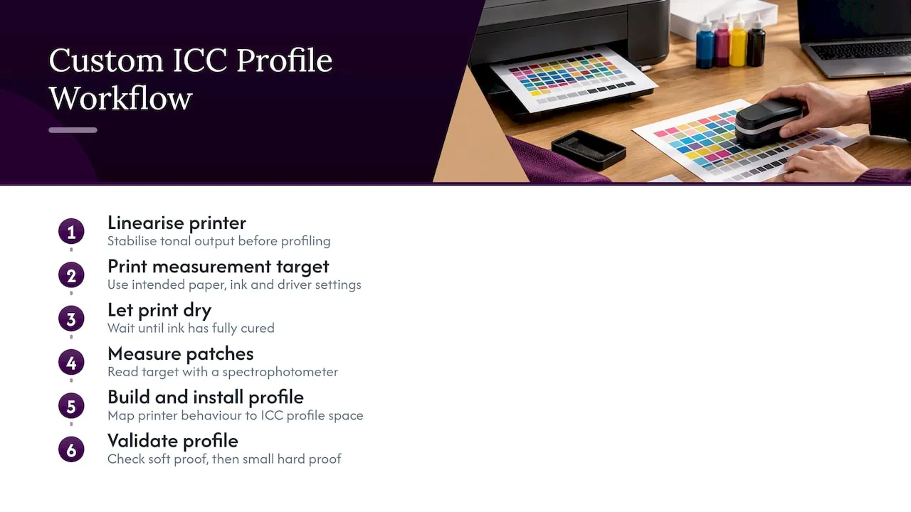
The process starts with linearisation, stabilising your printer’s tonal output so density mappings stay consistent before any colour reference is built; profiling on top of an unstable printer bakes that instability into the resulting profile rather than correcting it. Once linearised, print a measurement target, a large grid of colour patches supplied by your profiling software, using the exact paper, ink and driver settings you intend to use going forward, with colour management switched off in the driver so the raw patches reach the paper unaltered.
Let the print dry fully, since measuring too soon introduces errors as the ink continues to cure. Read the target with a spectrophotometer, which records how the printer actually reproduced each patch compared with its reference value. Profiling software then builds an ICC profile mapping your printer’s real behaviour to the profile connection space described in the ICC specification, the same reference framework used by commercial profiles.
Install the finished profile and select it in your editing application for that specific paper, then validate it with a soft proof followed by a small hard proof. Rebuild the profile whenever you switch to a different ink set, paper batch or printhead, since any of these can shift the printer’s output enough to make the old profile inaccurate.
Understanding colour gamuts and printer colour spaces for craft printing
A colour gamut is simply the range of colours a device can reproduce, and the gap between what you design on screen and what your printer can achieve matters more in craft work than many people expect. Monitors work in RGB and can display a wide range of saturated colours, particularly bright digital craft palettes, neon tones and deep jewel colours popular in card making and scrapbooking.
Printers, by contrast, mix a fixed set of inks, typically four to twelve colours, to approximate that same range, and some of the most vibrant on-screen colours simply fall outside what any ink set can match. This is where soft-proofing earns its keep: gamut warning overlays in your editing software flag exactly which areas of a design will need to be remapped, letting you adjust before printing rather than after.
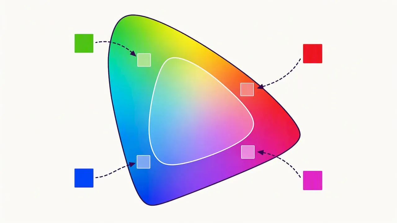
Craft printables often lean on flat, saturated colour blocks and fine linework rather than the smooth tonal gradients typical of photography, which changes how gamut limitations show up. A photo might show a subtle gradient clipping; a craft design might show a whole colour block shifting hue slightly, which is far more noticeable against adjacent flat colours. Choosing a rendering intent suited to your image matters here: perceptual intent tends to preserve the overall relationship between colours in flat, graphic designs, while relative colorimetric often suits photographic work where exact colour matching across most of the image matters more than overall harmony.
Knowing your printer’s practical gamut, and checking it against your typical craft palette, helps you choose paper and ink combinations that minimise the number of colours falling outside reproducible range in the first place.
How ink type affects colour calibration and print results
The ink in your printer shapes both the achievable colour gamut and how stable your calibration will stay over time, so it is worth understanding before troubleshooting unexplained colour shifts.
Dye-based inks typically produce more vibrant, saturated colour on glossy and semi-gloss papers, making them a common choice for photo-style craft prints, but they can be more prone to fading and colour shift over time, particularly under UV exposure. Pigment inks tend to sit more on the paper’s surface, offering better longevity and often more consistent results on matte and textured craft stock, though sometimes with a slightly narrower gamut on certain papers. Our guide to pigment versus dye ink covers this trade-off in more depth for craft and photo printing specifically.
Switching ink type, or even switching to a different cartridge formulation from the same manufacturer, is one of the changes that makes an existing ICC profile unreliable. The profile was built around a specific combination of ink chemistry, paper and printer behaviour, and altering any one of those three invalidates the mapping, even if the new ink looks similar on screen. Third-party or refilled inks introduce the same risk, often more acutely, since their colour response can differ meaningfully from the manufacturer’s original formulation that most off-the-shelf profiles assume.
If you work with multiple ink sets across different projects, such as dye-based for photo cards and pigment-based for long-lasting keepsake pieces, keep separate profiles for each combination rather than assuming one will serve both, and rebuild or re-verify a profile any time you change cartridge type or brand.
Troubleshooting colour calibration for card making and craft projects
Card making introduces colour challenges that pure photo printing rarely does, mostly because designs combine flat colour blocks, fine detail and text, often layered with embellishments after printing.
A common complaint is colour that looks correct on screen but prints noticeably darker or more saturated on the finished card. Before assuming a calibration fault, check monitor brightness first, since an overly bright display routinely makes prints look disappointing even when the print itself is accurate; our ten-minute checklist for fixing dark printables walks through this specific issue. Next, confirm the application is managing colour and the driver is set to no adjustment, since double colour management shows up here as unexpectedly flat or oversaturated blocks of colour rather than the subtler shifts seen in photographic gradients.
Banding across flat colour areas, a common card-making complaint, usually points to a nozzle issue or an incorrect media type setting rather than a profiling problem; run a nozzle check and confirm the paper type selected in the driver matches what is loaded. If colours shift subtly between a design preview and the final printed card despite a correct profile, check that the paper stock matches exactly what the profile was built for, since even a different weight or coating within the same product line can shift results. For broader settings issues specific to card stock, our guide to printer settings for card printables covers jam-prone and smudge-prone setups that often masquerade as colour problems.
Calibrating for layered and mixed media craft projects
Mixed media and layered card projects add a variable that pure digital printing does not face: how printed colour interacts with other materials applied afterwards, such as glitter, embossing powder, ribbon or fabric.
Heat-embossed elements, varnish or adhesive layers can shift how a printed colour appears once dry or cured, sometimes deepening tones or adding sheen that was not part of the original soft proof. There is no profile for this interaction, since it happens after printing, so the practical approach is to treat your calibrated print as the accurate baseline and test embellishment effects separately on a small proof piece before committing to a full project. If you consistently use a particular combination, such as a specific cardstock with a particular glitter adhesive, keep notes on how the finished colour compares with the raw print, since this becomes a predictable offset you can design around rather than a mystery each time.
Printing onto unconventional surfaces, such as mugs, fabric or other craft substrates, often needs adapting a proofing approach rather than a wholly different one. The guide to mug printing methods from Mugnificent Deals covers how small makers test and adjust print methods across different substrate types, a useful parallel for crafters moving beyond standard paper stock. In all cases, the same principle applies: proof small, proof cheap, and judge the finished combined result rather than the print alone.
Digital craft designs versus photographic prints: what changes
Photographic prints and digital craft designs put different demands on a calibrated workflow, even though the underlying steps, monitor calibration, profiling, soft proofing, stay the same.
Photographs rely heavily on smooth tonal gradation and subtle skin tones, so even small calibration drift becomes visible as banding or an off colour cast across a face or sky. Rendering intent choice matters more here, and relative colorimetric is often preferred to preserve accurate colour across most of the tonal range.
Craft designs, by contrast, tend to use flat, saturated colour fields, fine outlines and high contrast between elements, areas common in card fronts, scrapbook papers and cut file artwork. Gamut clipping shows up differently: instead of a subtle gradient shift, a whole shape might shift hue, which stands out more sharply against neighbouring flat colours. Perceptual rendering intent often suits this style better, since it preserves relative relationships between colours rather than prioritising exact colorimetric accuracy for any single tone.
Text and fine linework, common in both card sentiments and cut file outlines, are also more sensitive to driver-level sharpening or colour adjustment than photographic detail, so keeping the driver set to no colour adjustment matters even more when the artwork includes crisp graphic elements. Understanding which category your current project falls into, photographic or graphic, helps you choose rendering intent and proofing approach more deliberately rather than applying the same settings to every job by default.
Practical perspective: calibration tips for small-batch crafters
Crafters have less margin for wasted materials than high-volume print shops, which makes pattern proofs and soft-proof discipline genuinely practical rather than optional extras. A calibrated workflow pairs naturally with print-ready craft files, since accurate colour only matters once the design itself is reliable to begin with.
— Rob
Print-ready craft downloads from Craftsuprint
Once your workflow is calibrated, having print-ready files designed with consistent colour in mind makes the whole process faster. Online platforms offer a wide selection of printable designs built for exactly this kind of home printing, from card fronts to full scrapbook kits, so the artwork side of the equation is already sorted before you touch a single setting.
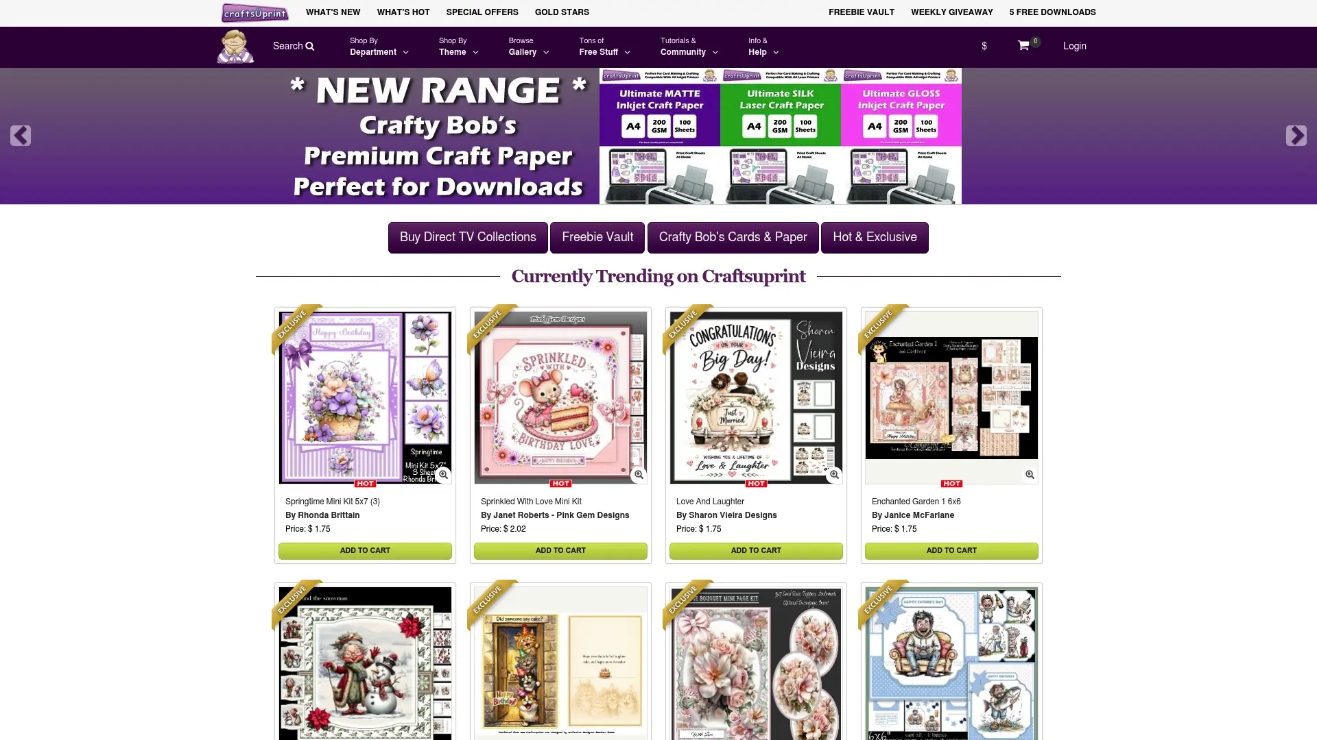
- Browse card making downloads for ready-to-print card fronts and toppers.
- Explore paper craft designs spanning a wide range of themes and styles.
- Check designer resources for templates and assets built with print quality in mind.
Pair any of these with your freshly calibrated setup and start printing with confidence straight away. Browse the full Craftsuprint marketplace to find your next project.
FAQ
Why is my printer not printing correct colours?
The most common cause is double colour management, where both your editing application and the printer driver try to convert colour at once, producing muddy or shifted results. Wrong paper or media type settings, an outdated or missing ICC profile, and excessive monitor brightness are the next most frequent culprits.
Do I need to calibrate every time I print?
No, calibration itself is not needed for every print job, but you should recalibrate or re-profile after a new paper type, a printhead change, a long idle period or a shift in your working environment, as HP’s support guidance outlines. Routine prints only need a quick soft-proof check and, ideally, a small pattern proof before committing a full sheet.
How do I colour calibrate manually?
Manual calibration involves printing a measurement target with colour management switched off, letting it dry fully, then reading the patches with a spectrophotometer to build a custom ICC profile through dedicated profiling software. This approach is typically used for unusual papers or ink sets that fall outside manufacturer-supplied profiles.
What is the best free colour calibration software?
There is no single definitive free tool; most operating systems include a basic built-in monitor calibration wizard, and photo editors such as Photoshop include free soft-proofing tools once a paper profile is installed. Free options are workable for casual printing, but a hardware colourimeter generally gives more reliable results for colour-critical photo or craft work.
What’s the difference between printer calibration and profiling?
Calibration, often called linearisation, stabilises how a printer lays down ink tone so results stay consistent over time, while profiling creates an ICC profile mapping that stabilised output to a shared colour reference, as described in the ICC specification. Linearisation should always happen first, since profiling on an unstable printer locks in that instability rather than correcting it.
Sources
- ICC specification — International Color Consortium
- Epson Media Installer — Epson
- Colour calibration explained — Canon Europe pro stories
- How to color calibrate your monitor to your printer — PCMag