
Matte vs Glossy Paper: Pick the Right Finish for 5 Craft Projects
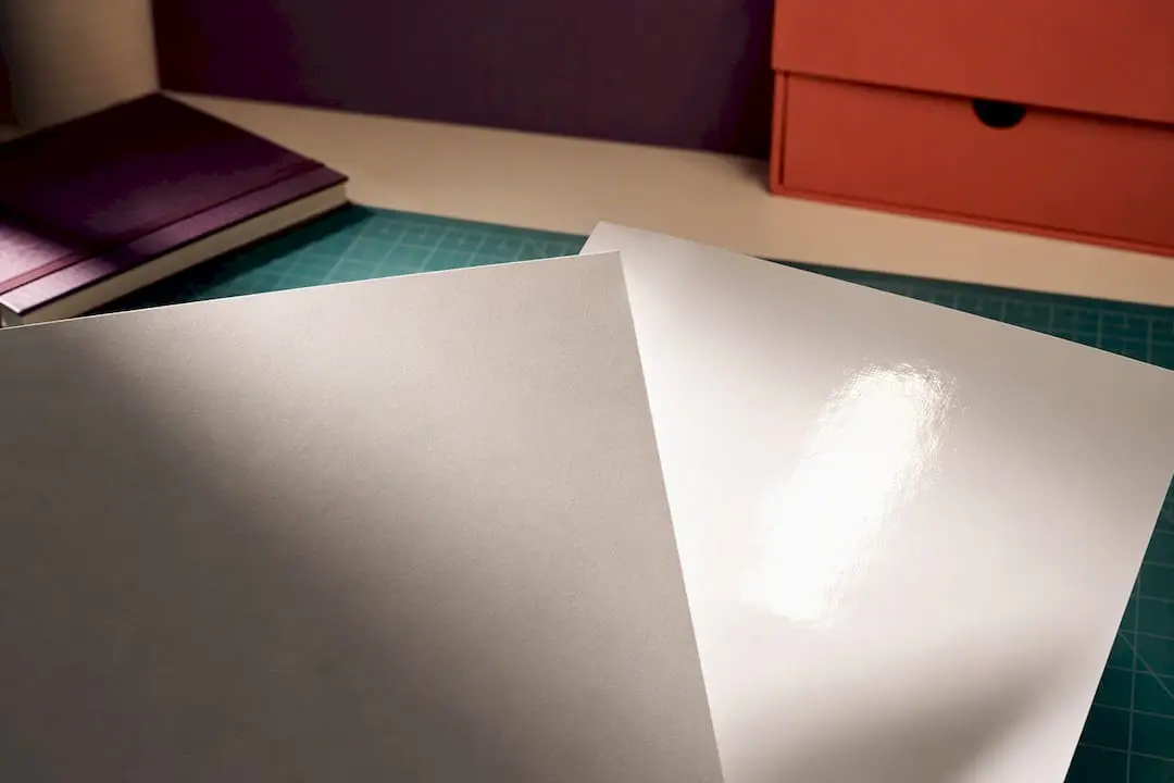
Choose gloss when the job needs colour to jump off the page, matte when the piece gets handled, written on, or read under harsh lights, and satin when you want a bit of both. A photo album or poster wants gloss’s punch; business cards, menus and craft printables usually want matte’s calm, glare-free surface. When you’re not sure, order a sample before you commit to a full run.
TL;DR:
- Glossy finishes provide the most vibrant colors and sharp detail but are prone to fingerprints and glare in bright lighting conditions.
- Matte paper offers excellent readability and fingerprint resistance, with muted colors and better performance under harsh light.
- Satin (or silk) balances color richness and glare reduction but sacrifices peak performance in both areas, suitable for portfolios and displays.
- Always test samples in real lighting and writeability conditions before ordering bulk, as finish appearance can vary between suppliers and printing methods.
- Choosing the right paper depends on the project’s purpose, handling frequency, and whether writing or glare reduction is more important.
Table of Contents
- Matte vs glossy paper: a quick comparison
- Why do matte and glossy papers look so different?
- Pros and cons of each finish for your project
- Which finish suits your specific project?
- What to check before you order paper or prints
- Does your printer or ink change the finish choice?
- How to actually test a paper finish before committing
- Craftsuprint’s guidance for choosing craft paper finishes
- A crafter’s honest take on picking finishes
- Get your finish right with Craftsuprint’s printable supplies
- Sources
- FAQ
Matte vs glossy paper: a quick comparison
Here’s how the two main finishes, plus satin, stack up against the things that actually matter when you’re picking stock for a print run.
| Attribute | Glossy | Satin | Matte |
|---|---|---|---|
| Appearance (shine) | High shine, mirror-like | Soft sheen, low glare | Flat, no shine |
| Glare/readability | Poor under bright light | Good in most lighting | Excellent, readable everywhere |
| Colour vibrancy | Highest saturation and contrast | Strong, close to gloss | Softer, slightly muted |
| Fingerprint resistance | Poor, shows marks fast | Moderate | Very good, hides prints |
| Writability | Poor, ink beads or smears | Fair | Excellent, takes pen and pencil |
| Typical best uses | Photo prints, posters, glossy flyers | Framed prints, portfolios | Business cards, menus, craft printables |
Finish names and exact coatings vary between paper suppliers, and even between print shops using the “same” finish name. Always check a physical sample against the description before ordering in bulk.
Why do matte and glossy papers look so different?
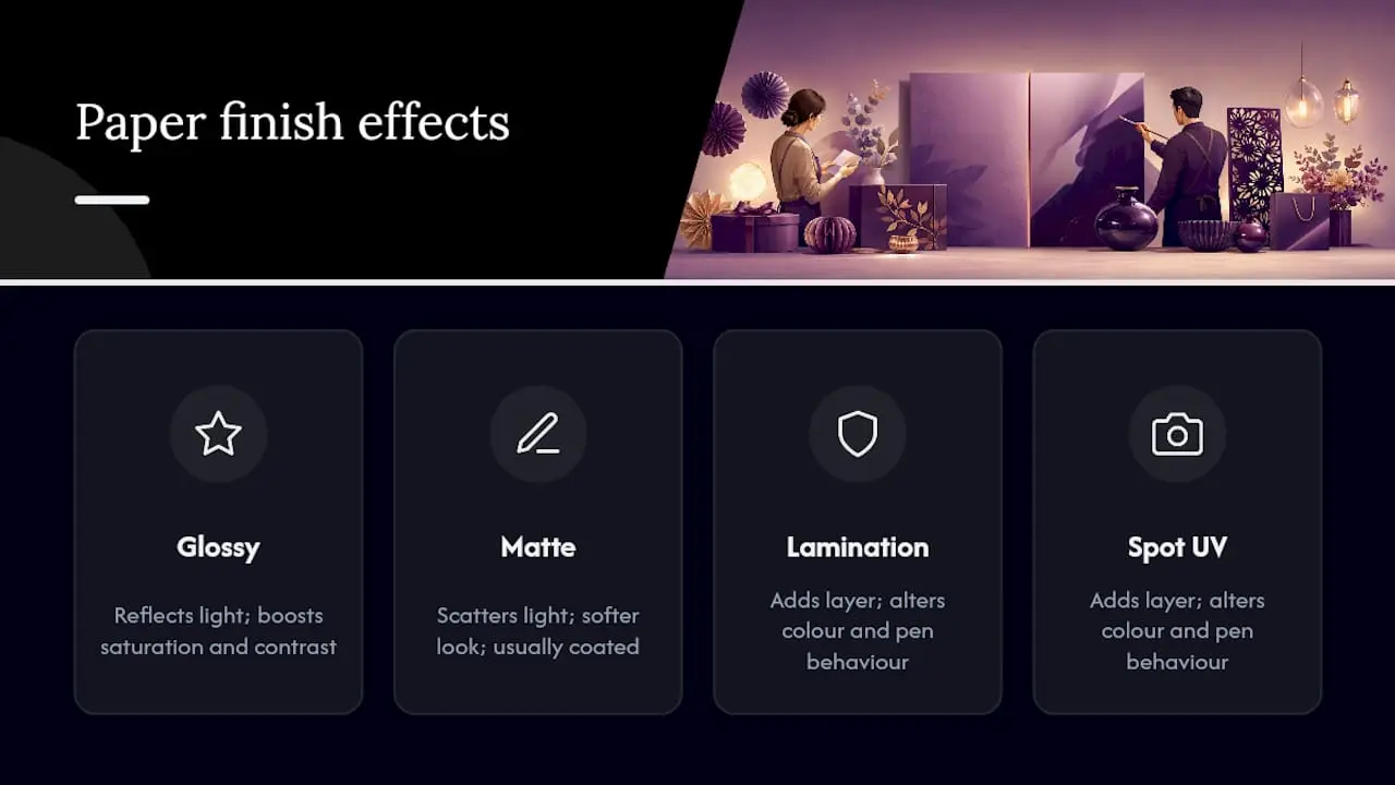
The difference comes down to what happens when light hits the coating. Glossy coatings reflect light directly back at the viewer, which boosts colour saturation and contrast, while matte coatings scatter that light across the surface, producing a softer, less reflective look.
There’s a persistent myth worth killing here: matte paper is not “uncoated” paper. Matte stock is usually coated too — the coating formula is just engineered to diffuse light rather than bounce it. The visual softness you see is a deliberate optical effect, not the absence of a finishing layer, and matte coatings can hold up just as well over time as gloss ones.
Paper weight plays into this too. A heavier matte stock feels more substantial in the hand and tends to read as “premium” even before anyone notices the finish. Lamination and spot UV coatings add another layer on top of the base finish, which changes both how colours appear and how the surface behaves under a pen. A comparison of paper types and pressing behaviour shows just how much these variables interact, which is why two “matte” stocks from different suppliers can still look and feel noticeably different.
Pros and cons of each finish for your project
Weighing up matte vs glossy for cards, photos or craft work comes down to trade-offs. None of the three finishes wins on every count, so match the strengths to what the piece actually needs to do.
Glossy paper
- Pro: delivers the most vibrant colour and sharpest apparent detail, especially in photos with rich reds and blues.
- Pro: resists moisture slightly better than matte, useful for anything that might get damp.
- Con: shows fingerprints and glare far more readily than matte, which is a real problem under shop lighting or camera flash.
- Con: pens skate or smear on the surface, so it’s a poor choice for anything you need to write on.
Matte paper
- Pro: no glare, so it stays readable under almost any light, including harsh fluorescents.
- Pro: hides fingerprints and handling marks, and takes pen, pencil, or fountain ink cleanly.
- Con: colour reads slightly more muted than gloss, particularly in bright, saturated images.
- Con: without lamination, matte can scuff more visibly over heavy handling than gloss.
Satin (sometimes called silk)
- Pro: cuts glare compared with gloss while keeping better colour rendition than matte, which is why designers often reach for it on portfolios and framed work.
- Con: it’s a compromise, not a winner on any single attribute, so it suits projects where balance matters more than maximum performance in one direction.
Pro Tip: Want the best of both worlds on a single card? Ask your printer about spot gloss over a matte base, sometimes paired with spot UV. You get a matte surface that’s easy to write on, with a glossy logo or accent that catches the eye. It’s a favourite trick for premium business cards and craft giveaways.
Which finish suits your specific project?
Picking a finish gets much easier once you think project-first rather than finish-first. Here’s how it usually breaks down:
- Photo albums and portfolios — gloss or satin gives skin tones and landscapes the punch they need, and satin cuts down reflections when pages get flipped through under lamps.
- Framed gallery prints — matte suits moody, tonal photography beautifully, but satin is the safer bet if the room has strong overhead or window lighting that would otherwise bounce off a glossy surface.
- Business and appointment cards — matte or soft-touch stock lets clients jot notes on the back, and many printers recommend this finish specifically where readability and writability matter more than shine. Add spot gloss on the logo for contrast.
- Menus and labels — matte resists fingerprints in a busy restaurant, but gloss wipes clean faster if the environment is greasy or wet.
- Craft printables and templates — match the stock weight and coating to how you’ll use it. A card blank that needs folding and gluing behaves differently on 250gsm matte than on a lighter glossy stock, so check compatibility with your printable templates before buying in bulk.
What to check before you order paper or prints
A short checklist saves you from an expensive reprint. Before placing an order, work through these points with whoever’s printing the job:
- Confirm the project’s real purpose: will it be photographed, framed, handled daily, or written on?
- Think about the lighting where the finished piece will actually live, not the lighting in the print shop.
- Consider handling frequency: a menu handled hundreds of times a week needs different durability to a framed print nobody touches.
- Check whether anyone needs to write on the piece, since that rules out gloss immediately.
- Ask whether a physical sample of the exact stock is available before you commit to a run.
- Request a colour proof, especially for anything with skin tones or brand colours that need to match exactly.
- Get the specific paper weight in gsm, not just a vague “premium” or “standard” label.
- Get the exact finish name in writing. “Matte” and “satin” mean different things at different suppliers.
Ask your printer three direct questions: what’s the exact finish name, will they supply a sample of that exact stock, and which printer and ink type is being used to produce it. If a supplier can’t answer any of those, or won’t send a sample, or uses vague terms like “premium finish” with nothing more specific, treat it as a warning sign and look elsewhere.
Does your printer or ink change the finish choice?
Inkjet and laser printers interact with coatings differently, and it affects both finishes. Inkjet printers lay down liquid dye or pigment ink, which coated papers are designed to absorb and hold crisply; laser printers fuse toner onto the surface using heat, and some glossy or heavily coated stocks resist toner adhesion or show visible cracking where the sheet flexes. If you’re choosing inkjet vs laser for crafts or printables, check the stock is rated for your printer type before buying a bulk pack.
Paper weight changes how a finish reads too. Heavier matte stock feels denser and more premium in the hand, while glossy stock often looks visually denser regardless of actual gsm, simply because the reflective surface concentrates light. Lamination adds durability and a glossy or matte “feel” on top of the base print, but it also kills writability completely, so avoid laminating anything that needs a signature or handwritten note. Spot UV gives you a glossy highlight without laminating the whole piece.
Satin earns its keep here too: for displays under bright retail or gallery lighting, it avoids the harsh reflections gloss produces while still holding onto more colour depth than a fully matte sheet.
How to actually test a paper finish before committing
Never choose a finish from a screen alone; screens exaggerate gloss and flatten matte. Order the exact stock and finish as a physical sample or short proof run rather than trusting a supplier’s online mock up.
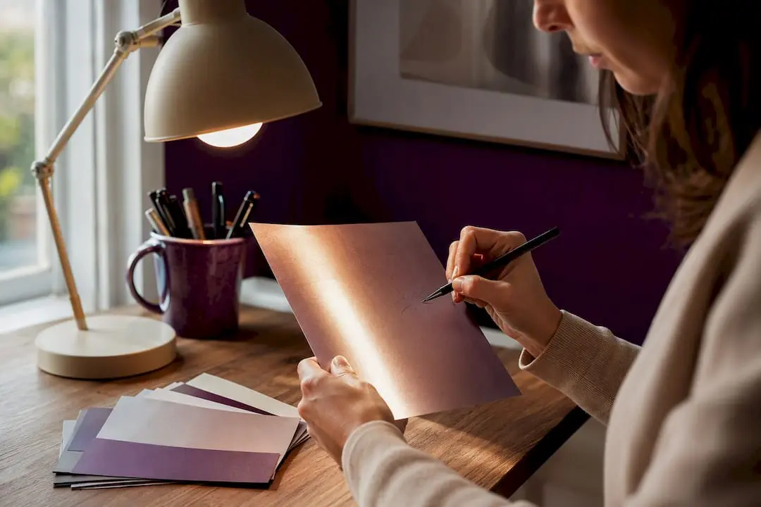
View the sample in the lighting where it’ll actually be used: hold a menu under restaurant lighting, flip through an album page the way you would at home. Test writing on it with the actual pen you intend to use, and photograph the sample under normal conditions to see how it reads on camera before you order more.
Craftsuprint’s guidance for choosing craft paper finishes
Craftsuprint stocks printable craft downloads, card making kits, and paper patterns designed with home printing in mind, alongside tutorials that walk through pairing a design with the right stock. Getting the finish right matters more for craft projects than most people expect, since a template designed for matte cardstock can behave very differently on a glossy sheet once you start folding, gluing, or adding embellishments.
Browsing cardstocks and craft supplies alongside a guide to cardstock’s role in paper crafts gives a clearer sense of how weight and coating affect the finished card, before you commit to a full print run.
A crafter’s honest take on picking finishes
Match the finish to what the piece has to do, not to how it looks glowing on a screen. Order a sample, test it with your actual pen, try scanning a QR code on it if that’s part of the design. Craftsuprint’s templates and stocks are worth a look once you’ve settled on the finish, not before.
— Rob
Get your finish right with Craftsuprint’s printable supplies
Picking the right paper is only half the job. Craftsuprint gives you the other half: printable card kits, cardstock, and templates already matched to home printers, so you’re not guessing whether a design will fold, glue or write properly once it’s off the page.
Browse the craft supplies range to find cardstock weights suited to matte or gloss finishes, or grab the free members’ gift to try a printable design before buying stock in bulk. If you’re planning a bigger project, the paper crafts classifieds are worth a look too. Start with a small test print, check it against your chosen finish, then order the cardstock that matches.
Sources
- Gloss vs Matte vs Satin Photo Paper
- What is the difference between matte and glossy paper
- Matte vs. Glossy Finish: What’s Better For Print? | VistaPrint
- Gloss vs Matt: Choosing the Right Card Finish - Business Cards UK
FAQ
Do people generally prefer matte or glossy paper?
Preference splits by use: photographers and anyone chasing colour punch often lean gloss, while people handling or writing on printed pieces tend to prefer matte for its glare-free, fingerprint-hiding surface.
What are the pros and cons of matte paper?
Matte resists glare and fingerprints and takes pen or pencil cleanly, but colour reads slightly more muted than gloss and unlaminated matte can scuff with heavy handling.
Which finish is better, glossy or matte?
Neither wins outright. Gloss wins for colour vibrancy and image sharpness, while matte wins for readability, writability, and hiding fingerprints, so the better choice depends entirely on the project.
Is matte or glossy paper more expensive?
Finish alone rarely drives cost for typical print runs; sample requests, paper weight, and print process usually affect price more than whether you choose matte or gloss.
Is satin paper a good middle ground between matte and gloss?
Yes, satin reduces glare compared with gloss while keeping better colour depth than matte, making it a solid choice for framed prints and portfolios shown under bright lighting.