
Stop Color Complaints: Printables Color Profiles for Craft Sellers
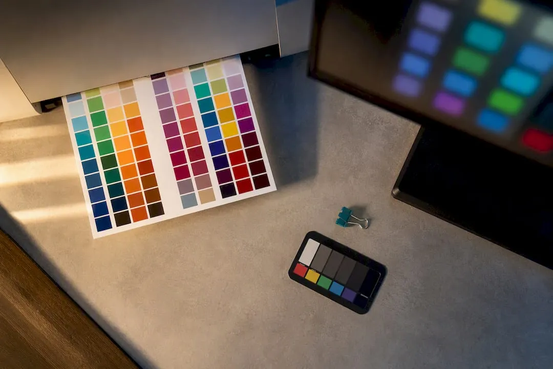
For most craft printables, supply tagged sRGB files at a suitable resolution that satisfies home printers and the majority of print-on-demand partners without extra work. Only produce a CMYK/ICC PDF when a printer or POD explicitly asks for one, and default to ISO Coated v2 (FOGRA39) if they don’t specify which profile. Whatever you export, run one test print before you upload it as that single check catches most colour complaints before they happen.
TL;DR:
- Using the correct ICC profile depends heavily on the substrate and print process, with most hobby projects only needing sRGB at 300 DPI.
- Embedding the appropriate colour profile, especially when exporting a CMYK PDF, is essential to prevent colour shifts during printing.
- Testing with a physical proof on actual paper provides the most reliable colour accuracy check before selling or publishing.
- Most home printers and POD services handle colour conversion from sRGB automatically, making pre-conversion unnecessary unless specific instructions are given.
- Consistency is best achieved by maintaining one master sRGB file and only creating additional profiles when a particular job explicitly requires it.
Table of Contents
- What are printables color profiles and why do they matter?
- How do I choose the right profile for my printable?
- How do I export files with the right colour settings?
- What’s the fastest way to test print colour before selling?
- How do I install and use ICC profiles for printing?
- Export checklist for Craftsuprint sellers
- Balancing colour accuracy with small-scale craft economics
- Where Craftsuprint fits into your colour workflow
- Sources
- FAQ
What are printables color profiles and why do they matter?
An ICC colour profile is a small file that tells a device how to translate colour from one system to another. Think of it as a translation dictionary between your screen, which mixes light (RGB), and a printer, which mixes ink (CMYK). Without that translation, a vivid teal on your monitor can print as a flat, muddy blue.
Not all profiles do the same job. Coated profiles like ISO Coated v2 (FOGRA39) assume glossy or silk paper that holds more ink; uncoated profiles assume matte stock that absorbs ink and needs less of it. Using the wrong one changes total ink coverage and can shift both saturation and contrast. This is why commercial printers ask which paper you’re targeting before recommending a profile.
For most people downloading a card template or a paper craft design, this only matters at certain moments:
- Printing a large batch through a commercial press rather than a home inkjet
- Working on a specialty substrate: canvas, metallic card, foil, or fabric
- Dye-sublimation projects, where ink and paper chemistry behave very differently to standard printing
- Brand work where a specific colour, like a logo shade, has to match exactly every time
Outside those cases, colour management for printables stays simple. Most hobby printing never needs a hand-picked ICC profile at all.
How do I choose the right profile for my printable?
You don’t need to become a colour scientist to get this right. Work through it in order, and stop as soon as one step applies to you.
- A printer or POD gives you a specific profile. Use it. Convert and embed exactly as they instruct, and don’t substitute a different one because it seems close enough.
- No profile supplied, and you’re printing at home or through a POD that accepts RGB. Export tagged sRGB at 300 DPI. This is the safe default for the vast majority of craft printables, since consumer devices and most POD backends expect sRGB and convert reliably.
- You’re supplying a European offset or contract press and they’ve asked for CMYK. Use ISO Coated v2 (FOGRA39) unless the printer names their own profile, and only convert to CMYK for that specific job.
- You’re working with an unusual substrate. Uncoated card needs PSO Uncoated (FOGRA29) rather than the coated default. Sublimation projects need the vendor’s paper and ink ICC, or their dedicated RIP software. Canvas and metallic finishes vary enough between vendors that you should follow whatever guidance that specific supplier gives.
Pro Tip: Keep a single “master” sRGB file as your source of truth, and only branch into CMYK or specialty ICCs when a specific job demands it. Sellers who try to pre-convert everything “just in case” end up managing five versions of a file that ninety per cent of buyers will never need.
How do I export files with the right colour settings?
Design in sRGB from the start rather than Adobe RGB or ProPhoto. Those wider colour spaces look richer on a calibrated monitor, but they can produce unpredictable yellow or green casts on consumer printers that never see that extra colour range translated correctly.
When you export, check the file actually carries the tag “sRGB IEC61966-2.1” rather than assuming it. Most image editors show this in the document colour settings or the export dialogue, and it takes seconds to confirm.
- Export PNG or JPEG at 300 DPI for home and POD use; this remains a reliable baseline resolution for printables.
- Only build a CMYK PDF when a printer specifically requests one. Use PDF/X format, embed their supplied ICC profile, and embed your fonts too.
- Always embed the colour profile on export. An unembedded file leaves the printer’s software to guess your intended colour space, and that guesswork is exactly what causes shifts between what you designed and what arrives on paper.
- Package both the sRGB asset and an optional printer-ready PDF in one ZIP so buyers have whichever they need. Watch your overall file size against marketplace upload limits if you’re distributing through a third-party platform.
What’s the fastest way to test print colour before selling?
Soft proofing gets you most of the way there for free. In Photoshop or Affinity, set the proof profile to your intended output (ISO Coated v2, for instance) and compare it against the original. It’s useful for catching obvious problems early, but it’s a simulation on a backlit screen, not the real thing.
A physical hard proof is still the most reliable way to check printed colour before committing to a full run or publishing a listing. One printed copy on your actual paper tells you things a monitor never will.
- Print one copy on the paper you’ll actually recommend to buyers, not whatever’s loaded in the tray.
- Set your printer driver to “no colour adjustment” if your design app is managing colour, or the reverse if it isn’t. Never let both fight over the conversion.
- Check saturation, tone, and contrast against the screen version, paying particular attention to skin tones and dark text.
- Confirm resolution, cropping, and bleed are correct on the physical sheet, not just in the file preview.
- If you sell through more than one POD, proof each one separately. A single test print per partner, photographed and kept with your records, settles most disputes before they start.
Keep those proof photos attached to your product listing notes. When a buyer says “the colours look off,” you’ll have your own reference to compare against rather than relying on memory.
How do I install and use ICC profiles for printing?
On Windows, right-click an .icc or .icm file and select “Install Profile,” or copy it manually into the Windows Color folder. On macOS, drop it into ColorSync via Profile Utility, or place it directly in the relevant Library folder.
Once installed, pick one workflow and stick to it:
- App-managed colour: Photoshop (or your editor) handles the conversion, so set the printer driver to “no colour adjustment.”
- Driver-managed colour: the printer driver does the conversion, so set your app to “printer manages colours” instead.
Running both at once is the single most common cause of double-converted, washed-out prints.
Sublimation setups are their own case. Dedicated systems and vendor RIP software often include calibrated profiles that outperform anything you’d find generically online, and third-party inks or papers usually need their own downloaded profile to behave predictably.
Pro Tip: If you’re producing the same design repeatedly for paying customers and colour consistency genuinely matters to your brand, a custom hardware-profiled ICC, built with a spectrophotometer and profiling software, is worth the one-off cost. For most hobby sellers, it’s overkill.
Export checklist for Craftsuprint sellers
Before you upload a new craft printable, run through this quickly:
- Include your main sRGB asset at 300 DPI, plus a CMYK PDF only if you’re targeting commercial print buyers specifically.
- Add a short README naming the colour profile, DPI, and recommended paper or finish.
- Keep one proof photo as your internal reference for that design.
- Mention recommended paper and print settings directly on your product page, not buried in a download.
A little upfront clarity here saves far more time than it costs, and it noticeably cuts down on post-purchase questions.
Balancing colour accuracy with small-scale craft economics
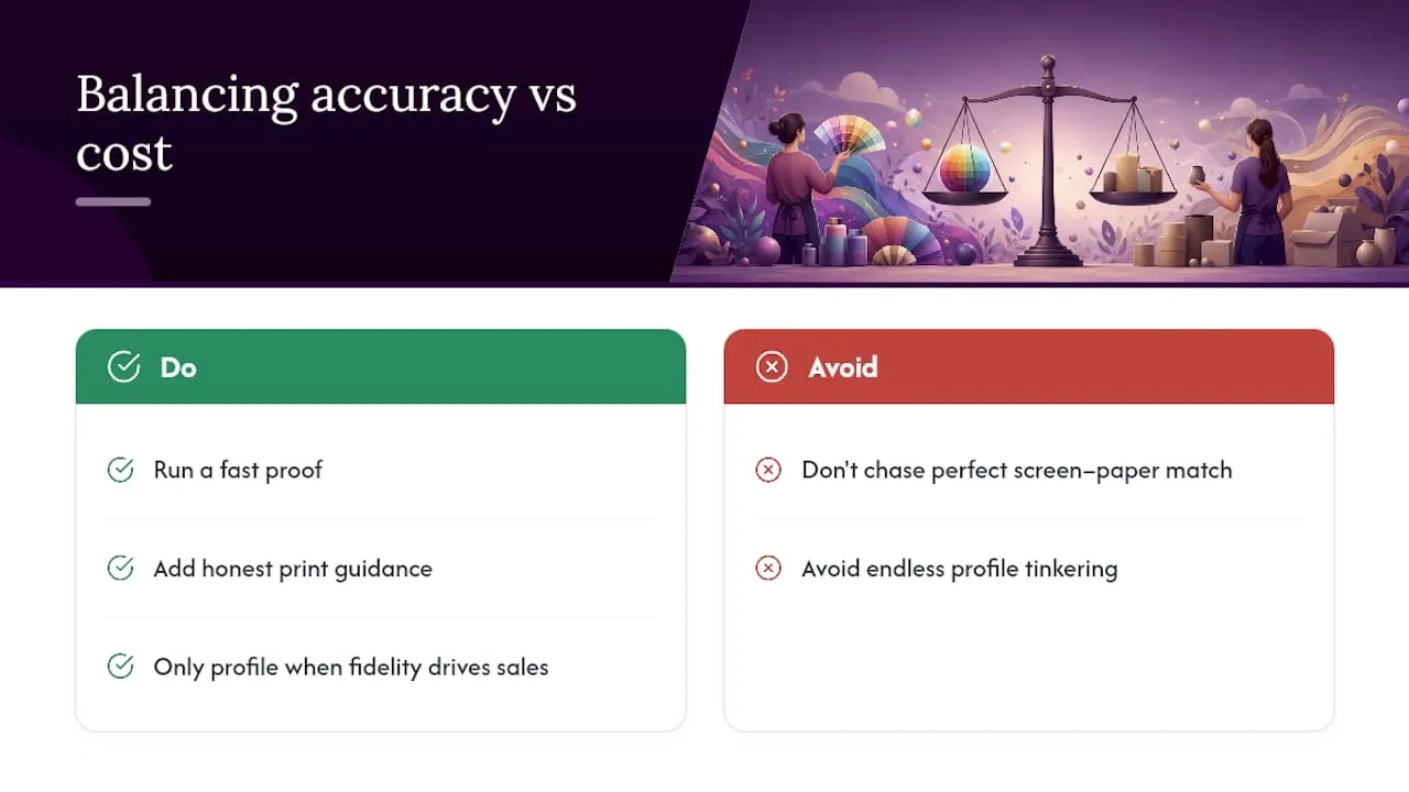
Chasing a perfect screen-to-paper match on every design is a losing game for small sellers. Most buyers print on whatever inkjet they own, on whatever paper was in the drawer, and small colour shifts are simply part of that reality.
The better use of your time is a fast proof and honest guidance on your listing, not endless profile tinkering. Save custom profiling for designs where colour fidelity genuinely drives sales.
— Rob
Where Craftsuprint fits into your colour workflow
Getting colour right is only half the job. The other half is making sure buyers actually know how to print what they’ve bought, and that’s where a lot of sellers lose time to avoidable refund requests. Some marketplaces provide designers with product pages that include a README, recommended paper notes, and proof photos alongside the downloadable files.
If you sell card templates, list them under Card Making with a short print-settings line so buyers aren’t guessing. Working across paper crafts more broadly? The Paper Craft and Designer Resources sections are worth browsing for export-ready templates and practical seller tips before you publish your next design. Set up your listing with clear colour guidance today, and fewer buyers will need to ask you why their print looks different from the preview.
Sources
- ICC Profiles Guide — Printery docs
- RGB vs CMYK for Etsy printables — SnapToSize
- Correct file formats: RGB and CMYK — Vistaprint hub
FAQ
What colour profile should I use for a craft printable?
Use tagged sRGB at 300 DPI unless a printer or POD specifically asks for something else. If they request CMYK for a commercial press job, ISO Coated v2 (FOGRA39) is the safe European default.
Do I need a CMYK file for printables sold online?
Not usually. Most home printers and POD services work from sRGB and handle their own conversion, so a CMYK file is only necessary when a specific printer requests one for a contract print job.
Why do my printed colours look different from my screen?
This usually comes down to an unembedded or mismatched colour profile, a wide-gamut design space like Adobe RGB, or a printer driver double-converting colour. A hard proof print, checked against your original file, will show you exactly where the shift happens.
Does Craftsuprint sell colour-calibration tools?
Craftsuprint focuses on printable craft downloads, kits, and designer resources rather than hardware, so it doesn’t sell spectrophotometers or profiling devices directly. Its Designer Resources section does host templates and tutorials that help sellers prepare colour-accurate files before upload.
Is sublimation printing different for colour profiles?
Yes. Sublimation ink and paper behave very differently from standard inkjet printing, so vendor-supplied ICC profiles or dedicated RIP software usually produce far more reliable results than generic community profiles.