
Masculine card design style: your 2026 guide
TL;DR:
- Masculine card design emphasizes structure, restraint, and honest materials over decorative embellishments. It relies on minimal layering, geometric patterns, and earthy color palettes to create bold, tactile cards. Personalization and textured techniques enhance the style without relying on bright colors or florals.
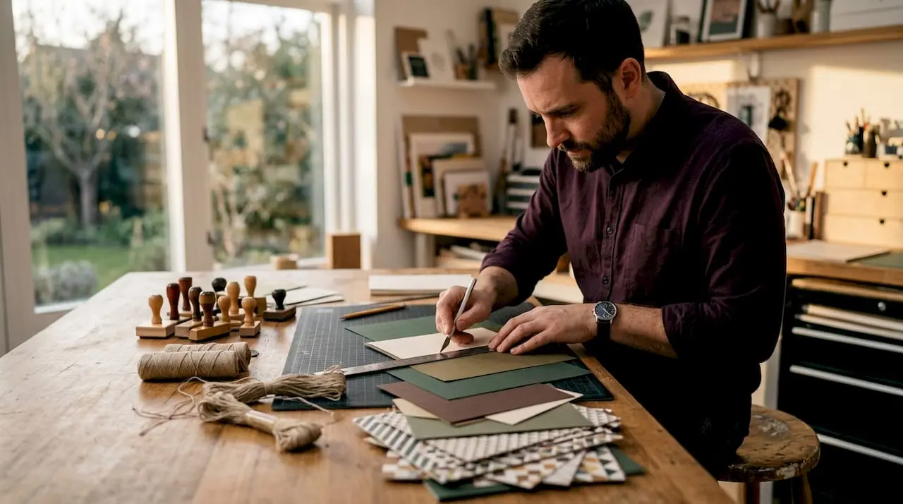
Masculine card design style is defined by structure, restraint, and purposeful embellishments that create bold, tactile cards without relying on florals, pastels, or decorative excess. In the crafting world, this approach is sometimes called “masculine aesthetic” or “restrained design,” but the core principle is the same: clean lines, honest materials, and a quiet confidence that speaks louder than embellishment. Whether you are making a birthday card for a father, a congratulations card for a colleague, or a Father’s Day piece, understanding masculine design elements gives your work a polished, intentional feel. Craftsuprint offers a wide range of templates and downloads that suit this style perfectly.
What is a masculine card design style, and what makes it distinct?
Masculine card design in 2026 is defined by structure, restraint, and minimalism, with clean lines and earthy, neutral colours at its core. This is not simply about making cards dark or heavy. It is about grounded, purposeful simplicity using honest materials and strong proportions.
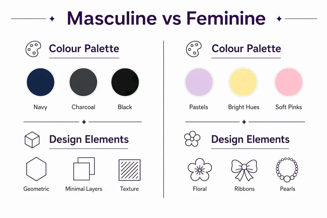
The style sits in contrast to embellishment-heavy approaches. Where a feminine card might layer ribbons, pearls, and floral die cuts, a masculine card achieves its impact through texture, geometry, and a tightly controlled colour palette. The result feels deliberate rather than decorative.

One of the most common misconceptions is that masculine cards are boring or plain. The opposite is true. Restraint requires more design skill, not less. Every element on the card must earn its place, which produces work that feels considered and confident.
Crafters who move from embellishment-heavy styles to masculine design often describe it as a mindset shift. You stop asking “what can I add?” and start asking “what does this card actually need?” That question produces better results every time.
What are the key visual elements and colour palettes in masculine card design?
Masculine colour palettes favour navy, charcoal, black, deep greens, browns, and neutrals, with pastels and bright hues firmly avoided. This palette supports the restrained, structure-focused aesthetic that defines the style. It also photographs well and prints cleanly, which matters when you are working with digital downloads from platforms like Craftsuprint.
Geometric patterns are the natural companion to these colours. Plaids, herringbone, stripes, and grid patterns all add visual interest without the complexity of layered florals. Clean lines in the pattern reinforce the structural quality of the overall design.
The table below shows how masculine and feminine card styles differ across key design categories.
| Design category | Masculine style | Feminine style |
|---|---|---|
| Colour palette | Navy, charcoal, black, deep green, brown, grey | Blush, lavender, mint, coral, bright white |
| Embellishments | Metal brads, twine, linen thread, wood grain | Pearls, ribbons, bows, rhinestones, flowers |
| Patterns | Geometric, plaid, herringbone, grid | Floral, watercolour, scallop, lace |
| Layering | Minimal, purposeful | Generous, decorative |
| Sentiment style | Bold, single word or short phrase | Flowing script, longer verse |
Minimal layering is another defining feature. Masculine cards typically use two or three layers of cardstock rather than five or six. Each layer serves a function, whether that is framing the focal point, adding a colour block, or providing a mat for the sentiment.
Pro Tip: Try tone-on-tone stamping using a slightly darker shade of your base cardstock colour. It adds depth and texture without introducing a second colour, keeping the palette tight and the design clean.
How do materials and embellishments create masculine card style and texture?
Effective masculine embellishments replace bows and pearls with twine, linen thread, metal accents like brads or clips, and wood grain textures. The principle is simple: every embellishment must justify its presence. If it adds texture or structure, it belongs. If it merely decorates, it does not.
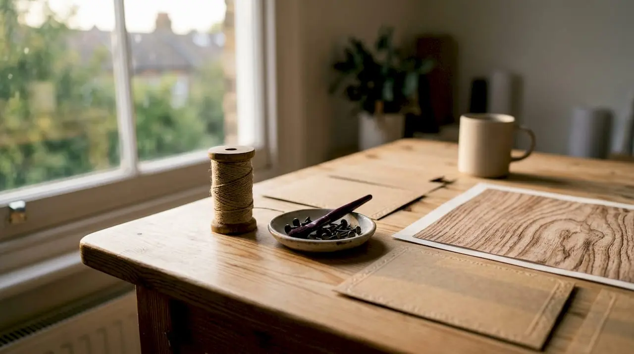
Texture is the real workhorse of masculine card design. Where a feminine card uses embellishments to create visual richness, a masculine card uses texture to create tactile interest. Embossing folders with brick, wood grain, or geometric patterns transform a flat sheet of cardstock into something that feels substantial and crafted.
Distressed edges are another effective technique. Running a brown or black ink pad along the edge of a cardstock layer adds depth and a slightly worn quality that suits themes like nature, tools, and travel. It takes seconds and costs nothing beyond the ink you already own.
The following materials work well for masculine card embellishments:
- Metal brads and paper clips in silver, bronze, or gunmetal
- Natural twine or linen thread tied in simple knots
- Wood grain patterned paper or veneers
- Leather or faux leather strips as accents
- Washi tape in plaid, stripe, or geometric prints
- Kraft cardstock as a base or mat layer
- Embossing powder in clear, silver, or black
Avoid these materials in masculine designs:
- Satin or organza ribbons
- Pearl or rhinestone embellishments
- Floral die cuts or punched flowers
- Glitter or shimmer papers in bright tones
- Lace or doily elements
Layered cardstock with embossing, distressed edges, and minimal decoration provides texture without overwhelming the design. The key is choosing one or two textural techniques per card rather than combining all of them at once.
Pro Tip: When adding twine or linen thread, tie it once and trim the ends short. A neat, tight knot reads as intentional. A loose bow reads as feminine, regardless of the thread colour.
What themes and motifs work best for masculine cards?
Popular masculine card themes include sports, tools, nature, nautical elements, and food and drink, with geometric patterns adding depth without complex layering. These themes work because they connect to real interests rather than relying on generic “male” symbols like ties or moustaches.
The most successful masculine cards are personalised to the recipient. A card featuring a mountain landscape means far more to a keen hiker than a generic “Happy Birthday” with a football. Personalisation creates more successful masculine cards than strictly adhering to masculine themes, because it strengthens the emotional connection between maker and recipient.
The table below summarises popular masculine card themes and how to personalise each one.
| Theme | Core motifs | Personalisation ideas |
|---|---|---|
| Nature and outdoors | Mountains, trees, rivers, wildlife | Add recipient’s favourite location or season |
| Sports and hobbies | Football, golf, cycling, fishing | Use team colours or specific equipment |
| Nautical | Anchors, ropes, compasses, waves | Reference a specific boat, harbour, or trip |
| Food and drink | Beer, whisky, coffee, barbecue | Include a favourite brand or flavour |
| Tools and making | Hammers, wrenches, blueprints | Reflect a specific project or trade |
| Geometric and abstract | Grids, chevrons, hexagons | Match recipient’s interior style or taste |
Geometric and abstract themes deserve particular attention. They suit recipients who do not have strong hobby interests, and they allow the design itself to carry the visual weight. A card built around a bold hexagon grid in charcoal and navy is striking without needing a single illustrative element.
For creative card themes that suit masculine aesthetics, think about what the recipient actually does in their spare time. That single question produces more meaningful cards than any list of masculine motifs.
What are expert tips and techniques for designing masculine cards that stand out?
Clear 3D gel adds tactile, raised texture without bulky layers, enhancing masculine card appeal while keeping cards easy to mail. Apply it over a stamped image or directly onto a geometric stencil to create a subtle raised effect that catches the light. The result looks expensive and feels considered.
Geometric die cuts are one of the most effective structural tools in masculine card design. A hexagon, chevron, or diamond die cut in a dark cardstock creates a focal point without any stamping or colouring. Layer it over a contrasting background and add a single bold word sentiment to complete the design.
Tone-on-tone stamping and ink blending
Tone-on-tone stamping and clear 3D embossing gels add tactile interest and sophistication while maintaining a minimalist masculine style. Use a slightly darker ink than your cardstock base, stamp a background pattern, and the result is a card that looks layered without actually being so. Ink blending in neutral or dark tones works on the same principle. A sponged gradient from charcoal to navy creates a moody, atmospheric background that suits nature or nautical themes.
Letting the paper do the work
High-quality patterned papers in wood grains, plaids, and geometric prints do most of the design work and save significant time. Cut a strip of plaid paper, mat it on kraft cardstock, add a metal brad and a single stamped sentiment, and the card is complete. The pattern carries the visual interest; you simply frame it well.
When mixing patterns, at least one subdued or plain element prevents visual clutter. A plaid strip paired with a solid navy mat and a white sentiment block is balanced. Two competing patterns with no plain anchor creates noise rather than design.
Typography as a focal point
Personalised typography using alphabet dies or meaningful words creates high-impact focal points with minimal effort. A single word like “LEGEND,” “CHEERS,” or “RESPECT” in a bold sans-serif die cut from dark cardstock becomes the entire design. You need nothing else. This approach suits crafters who want a quick, striking result without complex techniques.
Pro Tip: Keep your finished card under 5mm thick if you plan to post it. Masculine cards built on texture and die cuts can creep up in thickness quickly. A card that cannot be mailed without extra postage is a card that might not arrive on time.
Finishing touches matter more than most crafters expect. Glossy cardstock or a unique card opening, such as a gatefold or Z-fold, elevates a simple masculine design into something memorable. These details cost little in materials but add significant perceived quality.
Key takeaways
Masculine card design style succeeds through structure, restrained embellishments, and purposeful personalisation rather than dark colours alone.
| Point | Details |
|---|---|
| Colour palette | Stick to navy, charcoal, black, deep green, brown, and grey; avoid pastels entirely. |
| Embellishments | Replace ribbons and pearls with twine, metal brads, and wood grain textures. |
| Texture techniques | Use embossing, tone-on-tone stamping, and distressed edges for depth without clutter. |
| Theme and personalisation | Choose themes based on the recipient’s real interests rather than generic masculine symbols. |
| Typography | A single bold word die cut in dark cardstock creates a complete, high-impact focal point. |
Why I think masculine cards are harder than they look
Most crafters assume that making fewer decisions means less skill is required. Masculine card design proves that wrong every time. When you strip away the ribbons, the layers, and the floral die cuts, every remaining element is exposed. There is nowhere to hide a weak colour choice or a poorly placed sentiment.
The cards I find most satisfying to make are the ones where I have resisted the urge to add one more thing. A piece of wood grain paper, a strip of kraft cardstock, a single metal brad, and a bold stamped word. That is often enough. The restraint is the skill.
What I have also noticed is that masculine cards made for specific people land far better than those made to a formula. A card with a mountain silhouette means little to someone who has never hiked. The same card given to someone who climbed Ben Nevis last summer is genuinely moving. Personalisation is not a finishing touch in masculine design. It is the foundation.
My honest advice is to resist the temptation to follow a strict checklist of “masculine” elements. Dark colours, geometric patterns, and metal accents are tools, not rules. The goal is a card that feels right for the person receiving it. Sometimes that means breaking the palette. Sometimes it means adding a touch of warmth with a burnt orange or a deep teal. The style is a starting point, not a constraint.
Experiment with one new technique per card. Try clear 3D gel on a geometric stencil. Try a gatefold opening on a plaid background. Try a single alphabet die cut as the entire design. Each experiment teaches you something that no guide can fully convey.
— Rob
Ready to create your next masculine card with Craftsuprint?
Craftsuprint brings together an extensive collection of card templates and cutting files suited to masculine design aesthetics, from geometric shapes to nature-themed layouts. Whether you are after a quick download to print at home or a structured template to build on, the range covers the full spectrum of masculine card styles.
The paper crafts marketplace on Craftsuprint stocks patterned papers, kraft cardstock, and decoration materials that align directly with the restrained, texture-focused approach described throughout this guide. You can also browse free card verses to find the right sentiment for your design. If you are new to Craftsuprint, the free members gift for Create and Craft members is an excellent starting point for building your masculine card toolkit.
FAQ
What colours work best for masculine card design?
Navy, charcoal, black, deep green, brown, and grey are the standard palette for masculine cards. Pastels and bright hues are avoided because they undermine the restrained, structured aesthetic.
What embellishments suit a masculine card style?
Metal brads, natural twine, linen thread, and wood grain textures are the most effective choices. Ribbons, pearls, and floral die cuts are avoided in masculine card design.
How do I design masculine cards without them looking plain?
Texture is the answer. Embossing, tone-on-tone stamping, and distressed edges add depth and visual interest without adding embellishments or complexity.
What themes are most popular for masculine cards?
Sports, nature, nautical, tools, and food and drink are the most common themes. Personalising the theme to the recipient’s actual interests produces a stronger result than following a generic list.
Can I use patterned paper to simplify masculine card design?
High-quality patterned papers in wood grains, plaids, and geometric prints do most of the design work on their own. Pair a patterned strip with a plain mat and a single sentiment for a complete, polished masculine card.