
What is a birthday card design formula?
TL;DR:
- A birthday card design formula combines typography, layout, print standards, and personalisation to produce polished, heartfelt cards. It provides a structured framework that balances visual elements, technical specifications, and recipient details to ensure quality and emotional impact. Following this formula helps card makers create consistent, professional designs that can be further personalised for each occasion.
A birthday card design formula is a structured method that combines typography, layout, colour, and print specifications to produce professional, personalised cards every time. The formula is not a rigid rulebook. It is a repeatable framework that removes guesswork and gives card makers a clear starting point. At its core, the formula pairs a playful display or script font with a clean sans-serif typeface, arranges visual elements using compositional rules such as the odd number principle, and follows print standards including 300 DPI resolution and CMYK colour mode. Craftsuprint designers and independent crafters alike use this approach to produce cards that feel both polished and personal.
What is the birthday card design formula?
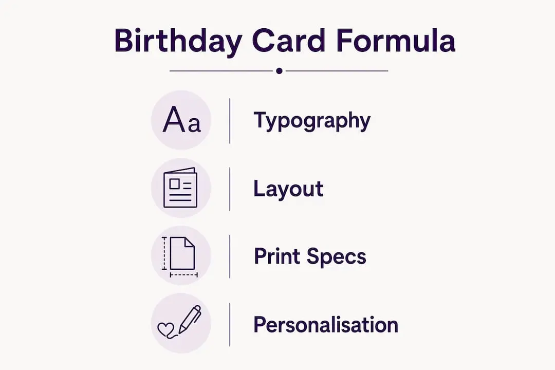
The birthday card design formula is best understood as four interlocking layers: typography, layout, technical print specs, and personalisation. Each layer depends on the others. Strong typography falls flat on a cluttered layout. A beautiful composition prints poorly without correct colour settings. Personalisation without structure produces cards that feel chaotic rather than heartfelt. The formula holds all four layers in balance.
Card design sits within the broader discipline of graphic design, where terms like visual hierarchy, compositional balance, and type pairing are standard vocabulary. You do not need a design degree to apply these principles. What you need is a clear framework, which is exactly what the birthday card design formula provides.

Starting with a single sentence that captures the card’s tone is one of the most effective ways to align visuals and message from the outset. Card designers recommend writing something like “warm and funny” or “elegant and heartfelt” before touching any design tool. That sentence becomes your filter for every decision that follows.
What font and typography rules form the basis of the formula?
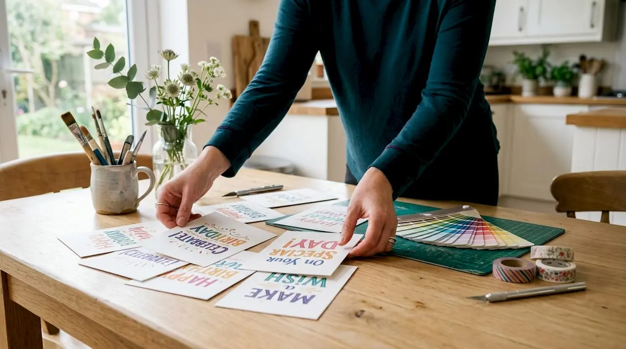
Typography is the single most visible element on any birthday card. Get it wrong and the card looks amateur, regardless of how good the artwork is. The festive formula for birthday cards pairs one playful display or script font for headlines with one clean sans-serif font for body text, limiting the total to two typeface families.
Two fonts is not a restriction. It is a discipline that produces clarity. When a card uses three or four different typefaces, the eye has nowhere to settle. Two fonts create a natural conversation between personality and readability.
Choosing the right font pairing
Different pairings communicate different moods. A rounded, bouncy script paired with Montserrat reads as playful and youthful. A thin serif display font paired with Gill Sans reads as refined and grown-up. The pairing you choose should match the recipient’s personality and the occasion’s tone.
- Playful cards: a hand-lettered script headline with a rounded sans-serif body font
- Elegant cards: a thin serif or calligraphy display font with a neutral sans-serif such as Futura
- Modern cards: a bold geometric display font with a light-weight sans-serif for contrast
- Children’s cards: a chunky, irregular display font with a simple, highly legible body font
Font size hierarchy matters as much as the pairing itself. The cover sentiment works best with one or two words at large scale, while longer messages sit inside on a smaller point size. This contrast creates visual drama on the front and warmth on the inside.
Pro Tip: Test your font pairing in greyscale before adding colour. If the hierarchy reads clearly without colour, it will read clearly with it.
Legibility over decoration
Script fonts are beautiful, but they fail at small sizes. Never set body text in a script font below 14pt. Display fonts on the cover can run large, 36pt and above, because they carry only a few words. The inside panel carries the emotional weight of the message, so legibility there is non-negotiable.
How do layout and element arrangement create a balanced card?
Layout is where most birthday card designs succeed or fail. A well-chosen font on a poorly arranged card still looks wrong. The goal is to guide the reader’s eye from the cover to the inside message without confusion or clutter.
The odd number rule
The odd number rule states that arranging decorative elements in groups of three or five creates more natural, balanced compositions than even-numbered groupings. This applies to floral clusters, sticker arrangements, balloon motifs, and any repeated graphic element. Even numbers feel static. Odd numbers feel dynamic and alive.
This principle comes from classical art composition and translates directly to card design. A cluster of three flowers in the top-left corner draws the eye inward toward the headline text. A cluster of four flowers in the same position creates symmetry that competes with the text rather than supporting it.
Designing across all four panels
A folded greeting card has four panels: front, inside-left, inside-right, and back. Many card makers treat these as separate pages. The strongest designs treat them as a coordinated spread. Colour, motif, and typographic style should flow consistently across all four panels.
| Panel | Primary purpose | Design guidance |
|---|---|---|
| Front | First impression and headline sentiment | Bold typography, strong focal point, limited text |
| Inside-left | Extended message or verse | Complementary motifs, readable body font, generous margins |
| Inside-right | Handwritten personal message | Keep almost entirely clear of graphics |
| Back | Brand, credit, or subtle decoration | Minimal design, small text, logo if applicable |
The inside-right panel deserves particular attention. Crowding it with graphics is one of the most common mistakes in birthday card design. That panel exists for the sender’s handwritten words. Leaving it clear is not a design failure. It is a deliberate act of personalisation.
Pro Tip: Use the rule of thirds to position your focal point. Place the main image or headline at one of the four intersection points of a 3x3 grid, not dead centre.
White space is not empty space. It is breathing room that makes every other element feel more considered. Cards that fill every corner look busy. Cards that use white space generously look confident.
What are the essential technical specifications for print-ready birthday cards?
A beautiful design that prints badly is a wasted effort. Technical specifications are the least glamorous part of card design and the most consequential. Getting them right separates a professional result from a disappointing one.
Resolution and colour mode
300 DPI in CMYK colour mode is the industry standard for print-ready card files. DPI stands for dots per inch. At 300 DPI, printed images appear sharp to the naked eye at normal reading distance. Below 150 DPI, pixelation becomes visible. CMYK (Cyan, Magenta, Yellow, Key/Black) is the colour model used by commercial printers. Designing in RGB and converting at the end produces colour shifts that can make vibrant reds look muddy and bright blues look dull.
Document size and bleed
- Set your document to the standard card size of 5 x 7 inches for a folded A5-equivalent card.
- Add a bleed of 0.125 inches on all four edges. Bleed is the area of artwork that extends beyond the trim line, preventing white edges if the cut is slightly off.
- Set a safe margin of 0.25 inches inside the trim line. Keep all text and critical artwork within this boundary to avoid clipping.
- Flatten layers and embed all fonts before exporting as a PDF/X-1a or high-resolution TIFF file.
- Proof the file on screen at 100% zoom before sending to print. What looks fine at 50% zoom often reveals issues at full size.
Cardstock and folding
200–300 gsm cardstock is the recommended weight range for birthday cards. Below 200 gsm, the card feels flimsy and folds poorly. Above 300 gsm, folding without preparation risks cracking the surface fibres.
Scoring fold lines with a bone folder before folding prevents cracked edges on heavier stocks. Run the bone folder firmly along a ruler at the fold line before bending the card. This compresses the fibres and creates a clean, professional fold every time.
| Cardstock weight | Characteristics | Best use |
|---|---|---|
| 160–180 gsm | Lightweight, flexible | Flat cards, inserts |
| 200–250 gsm | Firm, folds cleanly | Standard folded birthday cards |
| 270–300 gsm | Substantial, premium feel | Luxury cards, special occasions |
Matte and gloss finishes each suit different designs. Matte finishes suit handwritten-style fonts and watercolour artwork. Gloss finishes suit bold, graphic designs with saturated colours.
How can personalisation enhance the birthday card design formula?
The formula provides structure. Personalisation provides soul. A card built entirely on technical correctness but lacking any personal touch will feel cold. The goal is to use the formula as a scaffold and then fill it with details that are specific to the recipient.
Personalised details such as shared memories, inside jokes, or references to the recipient’s interests create far more impact than generic greetings. One specific line, “Happy birthday to the person who still laughs at that terrible joke from 2019,” lands harder than “Wishing you a wonderful day.” Specificity is the difference between a card that gets kept and one that gets recycled.
Practical ways to personalise within the formula
- Replace generic stock illustrations with a custom graphic or a personal photograph. Generic stock templates often produce a clip-art collage effect that reads as impersonal and low-effort.
- Choose a colour palette that reflects the recipient’s favourite colours or the event’s theme, rather than defaulting to standard birthday pink and gold.
- Select motifs that connect to the recipient’s hobbies, whether that is gardening, football, baking, or travel.
- Write the inside-left verse in a tone that matches your relationship with the recipient. Formal language for a colleague, warm humour for a close friend.
- Leave the inside-right panel clear and consider adding a faint ruled line or a subtle watermark to invite handwriting without making the space feel blank.
Design principles like the rule of thirds, white space, and alignment should support creativity rather than constrain it. A card that follows every rule but feels generic has missed the point. A card that bends a rule to serve the recipient’s personality has understood the formula correctly.
Pro Tip: Before you open any design tool, write one sentence describing the recipient’s personality. Let that sentence guide every creative choice, from font mood to colour palette to the motifs you select.
Building a curated set of go-to supplies and graphic elements also helps. Card makers who build a focused toolbox of favourite fonts, motifs, and embellishments produce more consistent results than those who reach for something new on every project. Consistency within a project, and variety across projects, is the mark of a confident card designer.
Themed designs offer another route to personalisation without starting from scratch. A themed card design built around a specific interest or aesthetic gives the formula a ready-made direction, reducing decision fatigue while keeping the result personal.
Key takeaways
The birthday card design formula works because it combines typographic discipline, compositional balance, print-ready technical standards, and deliberate personalisation into one repeatable process.
| Point | Details |
|---|---|
| Two-font rule | Pair one display or script font with one sans-serif; never use more than two typeface families. |
| Odd number composition | Arrange decorative elements in groups of three or five to create natural visual balance. |
| Reserve the inside-right panel | Keep this panel clear of graphics to leave room for a handwritten personal message. |
| Print to 300 DPI in CMYK | Use 300 DPI resolution and CMYK colour mode with 0.125-inch bleed for professional print quality. |
| Personalise with specifics | Replace generic stock images and greetings with details tied to the recipient’s personality and shared history. |
Why the formula is a starting point, not a straitjacket
I have seen card makers approach the birthday card design formula in two ways. The first group treats it as a checklist to complete. The second group treats it as a foundation to build on. The second group consistently produces better cards.
The technical rules, 300 DPI, CMYK, bleed, two fonts, odd numbers, exist because they solve real problems. Ignoring them produces cards that print badly, look cluttered, or feel unbalanced. But following them mechanically without any creative thought produces cards that are technically correct and emotionally empty.
The inside-right panel mistake is the one I see most often. Designers fill it with a decorative border, a secondary graphic, or a repeated motif, and then wonder why the card feels impersonal. That panel is not a design opportunity. It is a gift to the sender. Leaving it clear is one of the most thoughtful things a card designer can do.
My honest advice is to learn the formula thoroughly, then forget you are following it. When you know why the odd number rule works, you stop counting elements and start feeling whether a composition is balanced. When you understand why two fonts are enough, you stop being tempted by a third. The formula becomes instinct, and instinct is where the best cards come from.
If you want to see how selling your card designs can follow naturally from mastering the formula, the creative and financial rewards are very real for those who put in the work.
— Rob
Craftsuprint’s resources for card makers
Craftsuprint offers a wide range of resources that put the birthday card design formula into practice immediately.
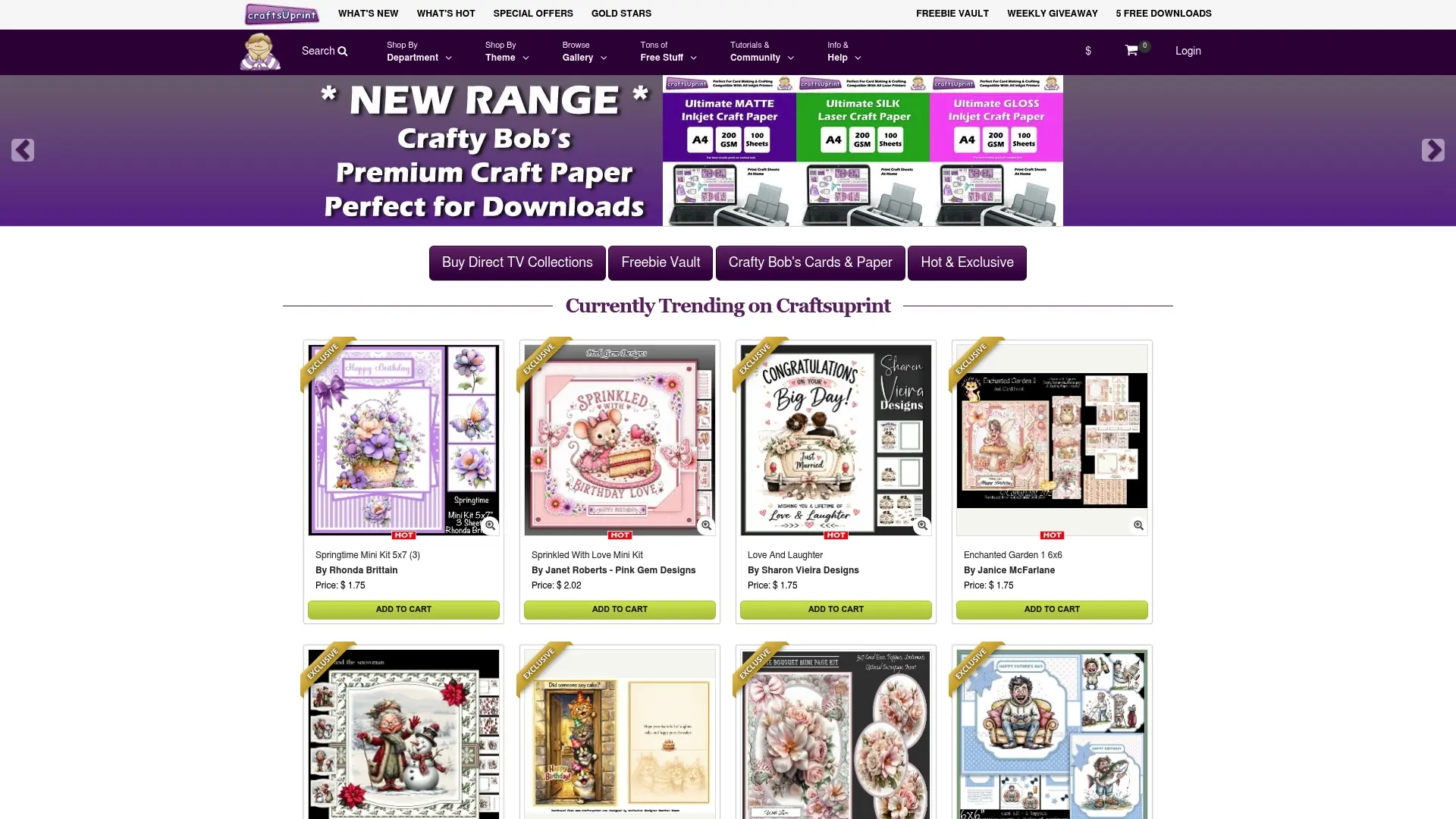
The Craftsuprint birthday card creator gives card makers a practical space to apply typography, layout, and colour choices without starting from a blank page. For those who prefer working from a solid foundation, the card templates and cutting files section offers professionally structured designs built to print-ready standards. Craftsuprint also stocks a broad range of craft supplies including decoration materials, specialty papers, and tools suited to card making at every level. Whether you are printing your first folded card or refining a design for a special occasion, Craftsuprint has the templates, supplies, and inspiration to support every step.
FAQ
What does a birthday card design formula include?
The birthday card design formula includes four core elements: typography (a two-font pairing), layout (compositional balance using the odd number rule), technical print specifications (300 DPI, CMYK, 0.125-inch bleed), and personalisation (recipient-specific details and reserved writing space).
How many fonts should a birthday card use?
A birthday card should use no more than two typeface families. The festive formula pairs one display or script font for the headline with one clean sans-serif for body text.
What resolution do I need for a print-ready birthday card?
Print-ready birthday cards require 300 DPI resolution in CMYK colour mode. Files should include a 0.125-inch bleed on all edges to prevent white borders after trimming.
Why should the inside-right panel be kept clear?
The inside-right panel is reserved for the sender’s handwritten message. Filling it with graphics removes the space for personal expression, which is the most emotionally significant part of any birthday card.
What cardstock weight works best for folded birthday cards?
200–300 gsm cardstock is the recommended weight for folded birthday cards. Score the fold line with a bone folder before folding to prevent cracked edges on heavier stocks.