
What is clean and simple card design?
TL;DR:
- Clean and simple card design relies on one focal image, negative space, minimal layers, and clean lines. It demands strong decision-making and precision, making it more challenging than layered styles. Practitioners should plan carefully, focus on balance, and embrace white space to create effective CAS cards.
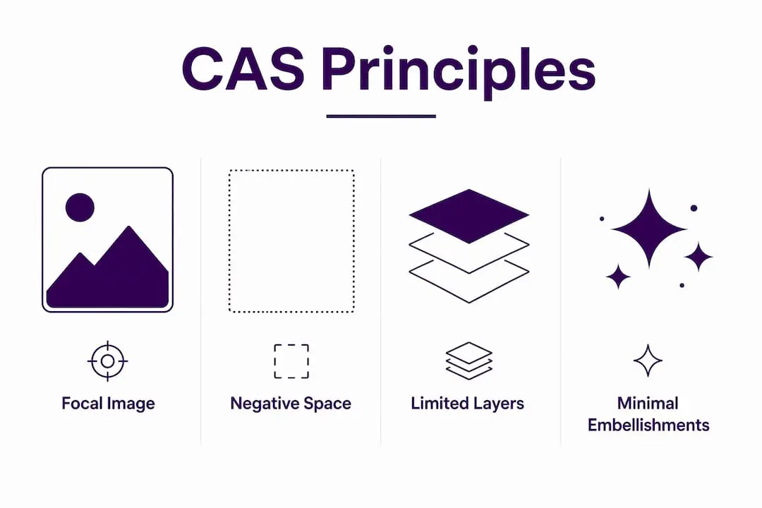
Clean and simple card design, widely known in the crafting world by its abbreviation CAS, is defined by four core pillars: a single focal image, generous negative space, minimal layering, and clean compositional lines. These four elements work together to create cards that feel purposeful rather than sparse. CAS is not a beginner’s shortcut. It is a disciplined design approach that demands strong decision-making at every stage. Hobbyists and graphic design enthusiasts alike find it one of the most rewarding styles to master, precisely because there is nowhere to hide a weak composition.
What are the essential principles of clean and simple card design?
CAS design rests on four pillars: a single main focal image, significant negative space, limited layers and embellishments, and clean lines that guide the eye with intention. Each pillar reinforces the others. Remove one, and the design loses its clarity.
The focal image
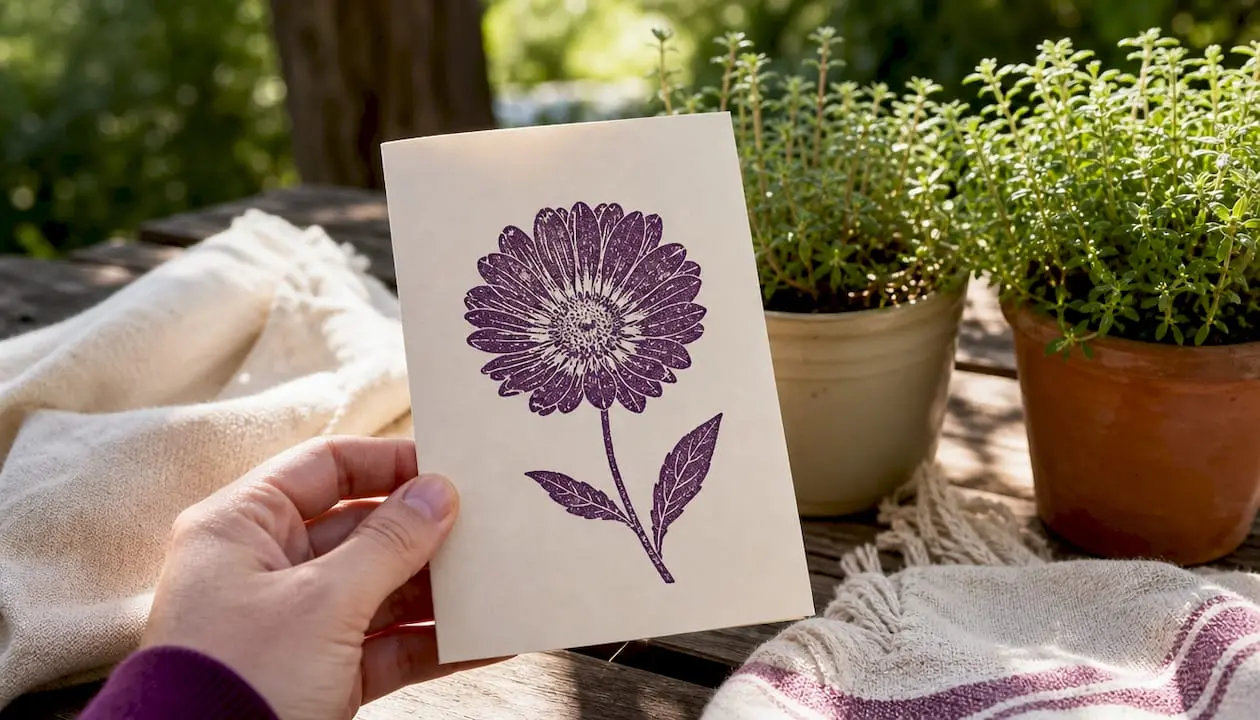
Every CAS card has one dominant visual element. That element carries the entire emotional weight of the design. A stamped floral motif, a die-cut silhouette, or a single typographic sentiment can each serve this role, but only one should lead. When two elements compete for attention, neither wins, and the card feels unresolved.
Negative space
White space gives a design room to breathe and allows the focal point to stand out without distraction. The term “white space” is slightly misleading. The open area does not need to be white. It simply needs to be uncluttered. A deep navy card base with a single gold sentiment still uses negative space effectively, because the surrounding area remains free of competing elements.
Limited layers and embellishments
CAS cards typically sit on one or two layers at most. This is where the style diverges most sharply from other cardmaking approaches. Rhinestones, ribbon, and multiple matted panels all add visual weight. In CAS design, that weight is deliberately absent. The restraint is the point.
Clean lines and composition
Placing a focal image off-centre using the rule of thirds creates dynamic flow rather than a static, centred composition. The rule of thirds divides your card into a three-by-three grid. Placing your focal element at one of the four grid intersections immediately makes the layout feel more considered. Straight, crisp edges reinforce this sense of order.
- Use a single stamp or die-cut as your focal point, never two competing images.
- Leave at least a third of the card surface free of any element.
- Limit embellishments to one type, such as a single row of sequins or one strip of washi tape.
- Apply the rule of thirds rather than defaulting to centred placement.
- Keep sentiment fonts clean and undecorated to match the card’s overall tone.
Pro Tip: Apply low-tack masking tape around the card edges before inking or stamping. Peel it away once dry for a crisp, professional border that adds structure without adding bulk.
How does CAS differ from clean and layered design?
Confusing clean and simple with clean and layered is extremely common, even among experienced crafters. The two styles share a tidy, uncluttered aesthetic, but they are built on fundamentally different construction methods.
Clean and layered (CAL) design uses multiple matted panels, embossed backgrounds, and textured embellishments to build depth. The layers are deliberate and visible. A CAL card might feature a stamped panel mounted on a patterned paper mat, topped with a die-cut frame, and finished with a cluster of pearls. Each layer adds dimension. The overall effect is rich and tactile.
A CAS card achieves its impact through the opposite approach. There are no stacked panels, no textured backgrounds competing with the focal image, and no embellishment clusters. The card base itself is often the only layer. The impact comes from colour contrast, composition, and the quality of a single stamped or printed image.
| Feature | Clean and simple | Clean and layered |
|---|---|---|
| Number of layers | One or two | Three or more |
| Embellishments | None or minimal | Textured clusters, pearls, ribbon |
| Background | Plain or lightly inked | Embossed or patterned paper |
| Complexity | High compositional skill | High construction skill |
| Mailing suitability | Excellent | Reduced due to bulk |
The misconception that CAS is simply “easier” is worth addressing directly. CAS design demands stronger decision-making because flaws cannot be masked by additional layers. A slightly off-centre stamp, a smudged ink edge, or a poorly chosen colour pairing is immediately visible. In a layered design, a rhinestone cluster can cover a multitude of sins. In CAS, there is nothing to hide behind.
This is precisely why experienced designers often describe CAS as the more demanding of the two styles. The skill lies not in construction but in composition, colour theory, and the confidence to leave space empty.
What practical steps help you create effective CAS cards?
Effective one-layer cards require careful upfront planning. The most common mistake is reaching for stamps and ink before deciding on the layout. A few minutes of planning prevents hours of frustration.
- Start with the sentiment. Place your sentiment first, as it anchors the entire composition. Once you know where the words sit, every other element positions itself in relation to that anchor.
- Use cut-out prototypes. Cut rough paper shapes to the size of your stamps or die-cuts. Move them around the card base before committing to ink. This costs nothing and prevents wasted card stock.
- Plan your colour palette before you begin. Choose two or three colours at most. One should dominate, one should support, and one should accent. A monochromatic palette with a single contrasting sentiment colour is a reliable starting point.
- Apply masking tape borders. Masking tape borders create crisp card edges that distinguish a polished CAS card from an amateur attempt. Apply the tape, ink or stamp your design, then peel the tape away cleanly once the ink is dry.
- Check your visual balance before finalising. Hold the card at arm’s length and squint slightly. If one area feels heavier than another, adjust the size or position of an element rather than adding a new one.
- Add subtle texture if needed. Subtle embossing can add interest without overwhelming the card’s clarity. A lightly embossed background using a tone-on-tone powder adds depth while keeping the design firmly in CAS territory.
- Scale your focal image correctly. An image that is too small looks lost. An image that is too large crowds the negative space. As a general guide, the focal image should occupy roughly a third of the card’s total area, leaving the remaining two thirds as breathing room.
Pro Tip: If your card feels unbalanced, resist the urge to add more elements. Instead, resize or reposition what is already there. Adding clutter to fix balance is the single most common CAS mistake.
Colour contrast deserves particular attention. A light-coloured image on a light card base disappears. A dark image on a light base, or a light image on a dark base, creates the visual tension that makes a CAS card striking. This contrast does the work that embellishments do in layered styles. You can explore card template creation guides to practise planning layouts before committing to final materials.
What are the benefits and challenges of CAS design for hobbyists?
CAS design offers genuine practical advantages alongside its aesthetic appeal. Understanding both sides helps you decide when to use it and how to approach it honestly.
The benefits are real and measurable:
- CAS cards are flat and lightweight, making them ideal for posting. A card with multiple layers and embellishments often requires extra postage or risks damage in transit.
- The style is highly reproducible. Once you have a layout that works, you can recreate it quickly with different colours or sentiments, making it perfect for batch card-making.
- CAS builds a strong design instinct over time. Because every decision is visible, you develop a sharper eye for colour, proportion, and composition faster than you would with layered styles.
- The modern, uncluttered aesthetic suits a wide range of recipients. A CAS card rarely feels too fussy or too juvenile for its intended audience.
The challenges are equally real:
- Planning takes longer than it appears. CAS requires more upfront planning than layered designs because every element must earn its place from the start.
- Stamping and cutting precision matters more. A slightly crooked die-cut or a smudged ink edge is immediately obvious without embellishments to soften it.
- Trusting empty space is psychologically difficult. Many crafters feel compelled to fill gaps, which is the instinct that CAS design requires you to override.
“The right design is personal and should reflect the creator’s intention. Technical rules like the rule of thirds are tools, not laws. A card that communicates genuine sentiment with clarity is always more successful than one that follows every compositional guideline but feels cold.”
This balance between technical discipline and personal expression is what makes CAS design genuinely satisfying. Personal sentiment is as important as technical composition. A card that moves its recipient has succeeded, regardless of whether the focal image sits precisely on a rule-of-thirds intersection. You can find mini kit ideas for crafters that work particularly well as starting points for practising this balance.
Key takeaways
Clean and simple card design achieves its impact through disciplined composition, generous negative space, and a single focal element, making it one of the most skill-intensive styles in cardmaking.
| Point | Details |
|---|---|
| Four core pillars | CAS design rests on a focal image, negative space, minimal layers, and clean lines. |
| CAS is not beginner work | Flaws are immediately visible without layers, demanding stronger compositional decisions. |
| Planning comes first | Start with sentiment placement and use paper prototypes before committing to ink. |
| Masking tape borders | Low-tack tape creates crisp edges that give CAS cards a professional finish. |
| Balance through adjustment | Fix visual imbalance by resizing or repositioning elements, never by adding more. |
Why I think CAS design is misunderstood by most crafters
Most crafters I encounter assume clean and simple means quick and easy. That assumption leads to disappointment. They stamp a single image in the centre of a card, leave the rest blank, and wonder why it looks unfinished rather than considered. The difference between an unfinished card and a CAS card is intentionality. Every empty area must feel chosen, not forgotten.
What I have found, after working with cardmaking principles for years, is that CAS design teaches you to trust your eye faster than any other style. When you cannot hide behind embellishments, you are forced to confront whether your colour choices actually work, whether your composition has genuine balance, and whether your focal image is strong enough to carry the whole design alone. That process is uncomfortable at first. It becomes deeply satisfying once you get past the initial resistance.
The other misconception worth challenging is that CAS cards lack personality. A single stamped image in a carefully chosen ink colour, placed with intention on a contrasting card base, can communicate more warmth than a card covered in layers and rhinestones. Restraint is not coldness. It is confidence. The essential craft supplies you need for CAS are genuinely minimal, which is part of the style’s appeal. You do not need a vast collection to produce something beautiful.
My advice is simple. Embrace the white space. Resist the urge to fill it. If something feels wrong, move or resize before you add. The card will tell you when it is finished.
— Rob
Ready to put CAS principles into practice with Craftsuprint?
Craftsuprint offers a wide range of printable card kits, downloadable templates, and craft supplies that suit the clean and simple approach perfectly. Whether you are looking for a single focal image stamp set or a minimal card layout to print and personalise, the Craftsuprint marketplace has options that keep your designs uncluttered and your creative process enjoyable.
New members can claim a free members gift to get started without spending a penny. The Craftsuprint craft supplies range includes everything from card stock to decoration materials suited to minimal, modern designs. If you prefer to browse ready-to-use downloads, the Create & Craft downloads section offers a curated selection of cardmaking content that fits neatly within CAS principles.
FAQ
What does CAS stand for in card design?
CAS stands for Clean and Simple. It describes a cardmaking style built on a single focal image, generous negative space, minimal layers, and clean compositional lines.
Is clean and simple card design suitable for beginners?
CAS is accessible to beginners but is not inherently easy. It demands precise stamping, strong colour choices, and confident use of empty space, since there are no embellishments to cover mistakes.
How is CAS different from clean and layered design?
Clean and layered design uses multiple matted panels, embossed backgrounds, and textured embellishments. CAS achieves its impact through a single layer, colour contrast, and composition alone.
How do I fix a CAS card that looks unbalanced?
Adjust the size or position of existing elements rather than adding new ones. Increasing the scale of the focal image or shifting it along a rule-of-thirds line resolves most balance issues without cluttering the design.
What supplies do I need to make a CAS card?
The supply list is genuinely short: a card base, one stamp or die-cut, ink or cardstock in two to three colours, and low-tack masking tape for crisp borders. You can browse mini card kit essentials for a practical starting point.