
300 DPI Baseline for Printables: What Crafters Need, When 150 Is OK
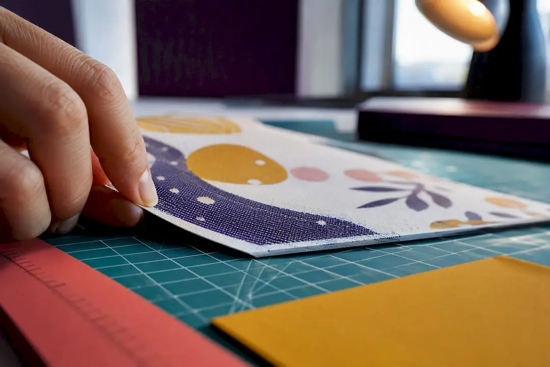
Use 300 DPI as your baseline for anything held in the hand, like cards, tags, or stickers. That figure changes once you’re printing something viewed from further away, such as a poster or banner, where you can drop to 150 DPI or even lower. The real rule underneath all of this: your pixel dimensions, not the DPI number in a file’s metadata, decide whether a print looks crisp or soft.
TL;DR:
- For common handheld prints like cards and stickers, 300 DPI is sufficient unless high detail is required, such as with fine text or barcodes.
- Large-format prints or posters viewed from a distance can be produced at lower DPI, such as 150, without losing perceived quality.
- Checking pixel dimensions against print size and DPI before printing ensures file readiness and helps avoid costly quality issues.
- Upscaling images beyond 150 percent often results in softness, so reduce print size or source higher-resolution files instead.
- Export files in formats like PNG, PDF, or TIFF, and convert to CMYK for professional printing to maintain color accuracy and quality.
Table of Contents
- Dpi for printables: what DPI and PPI actually mean
- Choosing DPI for printables by product and viewing distance
- How to check your file and calculate the pixels you need
- Export and file-format recommendations for printables
- Common mistakes and how to fix pixelation
- Practical examples and Craftsuprint author tips
- How this advice fits craft and small-business workflows
- How Craftsuprint helps with print-ready templates
- Sources
- FAQ
Dpi for printables: what DPI and PPI actually mean
DPI stands for dots per inch, and it describes something a printer does, not something an image file contains. PPI, pixels per inch, describes the image itself: how many pixels are packed into each inch of the file once it’s placed at a given print size. Crafters use the terms interchangeably because the confusion rarely costs them anything, until it does, usually the day a beautifully designed card comes off the printer looking like a blurred photocopy.
Here’s the mechanic that matters. A printer takes your image’s pixels and translates them into physical dots on paper. If your file has enough pixels to satisfy the DPI the printer expects, everything holds together. If it doesn’t, the printer either resamples the file (stretching existing pixels to fill gaps, which softens detail) or the print house rejects it outright. Adobe’s own resolution guidance confirms 300 PPI is the accepted standard for high-quality output, and that many workflows will resample automatically if your dimensions fall short.
Why 300 specifically? It traces back to prepress screening. Offset printing reproduces continuous tone using halftone dots measured in lines per inch (LPI), and the long-standing rule of thumb is to supply images at roughly 1.5 to 2 times the screen ruling. A common 150 LPI screen lands you at 225 to 300 PPI, and 300 became the round number the industry settled on. It also happens to sit near the limit of what the human eye can distinguish at typical reading distance, which is why it never got displaced by anything higher for handheld work.
Quick primer, for reference:
- DPI = dots the printer physically lays down per inch
- PPI = pixels packed into each inch of your image at a given size
- Effective resolution = your file’s actual PPI once it’s scaled to the print size you need
- 300 DPI = the convention for anything inspected at arm’s length
Choosing DPI for printables by product and viewing distance
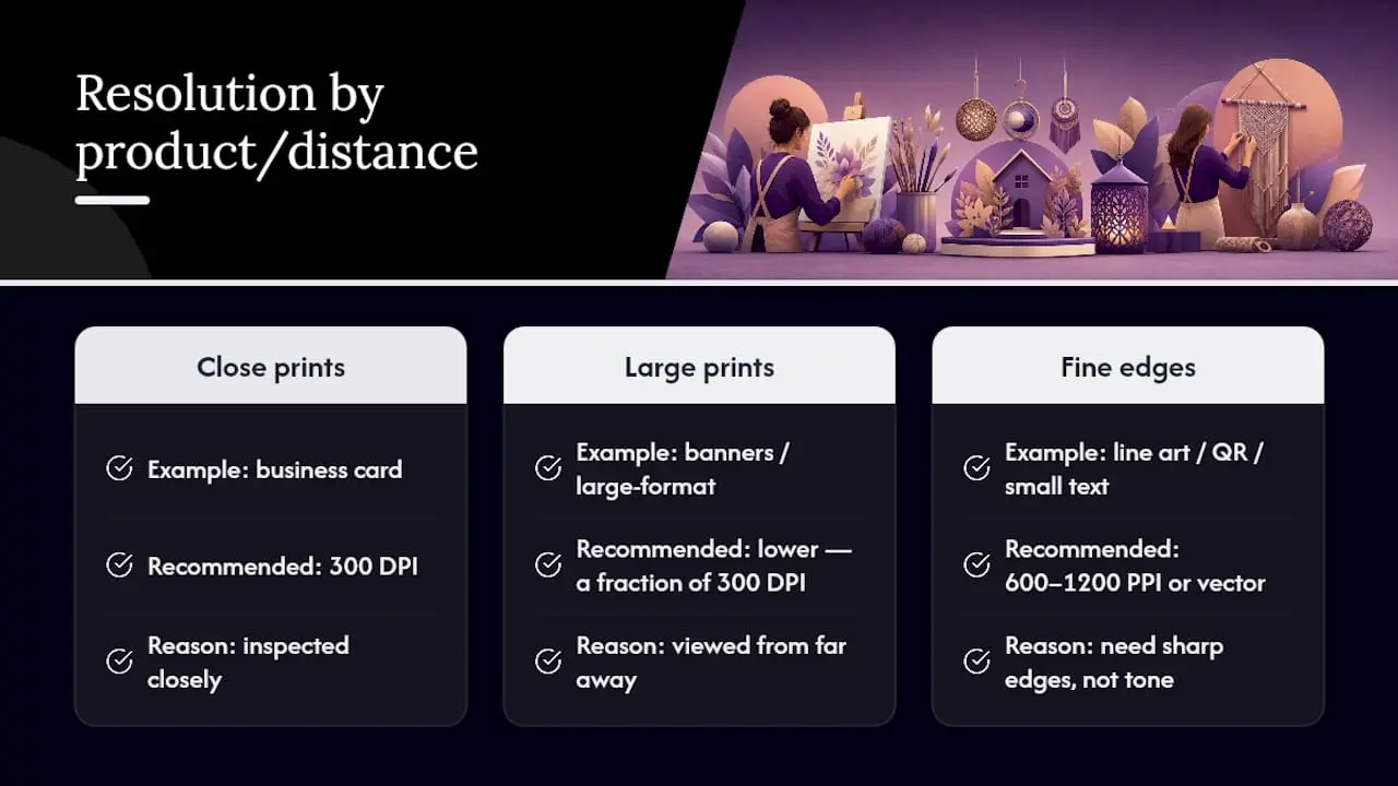
The 300 DPI rule isn’t universal, and treating it as one wastes file size and processing time on things nobody will ever inspect closely. Viewing distance is the variable that actually drives resolution requirements: the further away someone stands, the less resolution their eye can resolve, so banners and large-format prints can run at a fraction of the DPI that a business card needs.
Line art, QR codes, and small text break this pattern entirely. Because they rely on sharp edges rather than smooth photographic tone, they need much higher resolution, commonly 600 to 1200 PPI, or should be built as vector artwork so edges never rasterise at all. A QR code exported at 300 DPI can still scan fine at small sizes, but stretch it onto a poster and the same file turns into a fuzzy mess that phone cameras struggle to read.
Pro Tip: If a design mixes a photo background with fine text or a barcode, don’t compromise the whole file’s resolution to save space. Export the photo element at 300 DPI and keep text and codes as vector layers until the final flattening step, so both survive the print run.
How to check your file and calculate the pixels you need
Working out whether a file is print-ready takes one formula: required pixels = print size in inches × your DPI target. Apply it before you commit to a print run, not after.
- Decide your target size and DPI. A birthday card printed at 5×7 inches needs 300 DPI, so multiply: 5 × 300 = 1500, and 7 × 300 = 2100. You need a file at least 1500×2100 pixels.
- Check your file’s actual pixel dimensions. To check your file’s pixel dimensions, use your image editor’s properties or image size tool; confirming pixel counts is essential to ensure print readiness at the target DPI.
- Compare the two numbers. If your file already sits at or above the pixels you calculated, you’re set. If it falls short, either source a higher-resolution version or reduce your print size to match what the file can support.
- Repeat for each product size you’re preparing. An A4 sheet at 300 DPI needs roughly 2480×3508 pixels; a standard business card at 3.5×2 inches needs 1050×600 pixels; a 5×7 sticker sheet mirrors the card maths above at 1500×2100 pixels.
If your file falls short and you’re tempted to just scale it up in software, know the limit. Upscaling beyond roughly 150 percent of the original size usually introduces visible softness, because resampling invents pixels rather than recovering detail that was never captured. A resolution checker tool that reverse-engineers your maximum safe print size from actual pixel counts is worth bookmarking if you’re regularly working with supplied artwork of unknown origin.
Export and file-format recommendations for printables
The file format you export to affects colour accuracy, transparency, and how forgiving the print process is of small errors. Getting this wrong undoes careful DPI work before the file even reaches a printer.
- PNG works best when you need transparency, particularly for direct-to-garment printing or die-cut stickers where the background needs to disappear cleanly.
- PDF suits structured paper goods, card fronts, and multi-page projects, since it preserves vector text and embeds fonts reliably across different systems.
- TIFF is the safer choice for high-detail photographic work headed to a professional print house, as it avoids the compression artefacts that JPEG can introduce.
- Convert to CMYK before final export if you’re working with a commercial printer, since screens display in RGB and colours can shift noticeably once converted; check with your print supplier which they expect.
- Add bleed (typically 3mm) and crop marks for anything that prints to the edge, and always embed fonts in PDFs rather than relying on the recipient having the same typeface installed.
Kittl’s guidance on file formats for printing backs this pattern: PNG for apparel and transparency needs, PDF or TIFF for paper goods, and vector formats wherever text or logos appear, since raster text at low resolution is one of the most common causes of a rejected print file.
Pro Tip: Begin design projects at the appropriate physical size and DPI from the start; relying on a 72 DPI screen resolution and attempting later conversion does not add real detail.
Common mistakes and how to fix pixelation
Most pixelation problems trace back to one misunderstanding: people think changing the DPI number in an image’s settings improves quality. It doesn’t. Typing “300” into a DPI field when the underlying pixel count hasn’t changed just relabels the same data; the printer still has the same information to work with, and the print looks exactly as soft as it did before.
- Don’t rely on metadata changes. Adjusting DPI without adding pixels changes nothing about actual detail.
- Respect the upscaling ceiling. Software can stretch an image, but anything beyond roughly 150 percent of original size tends to show visible softness on close inspection.
- Reduce print size instead of stretching pixels. A file that’s too small for a 5×7 card might print beautifully at 4×5.
- Simplify complex designs when resolution is limited. Fine gradients and detailed textures expose low resolution faster than solid colour blocks do.
- Rebuild text and logos as vector art. Anything with sharp edges should never depend on raster pixels if you can avoid it.
Practical examples and Craftsuprint author tips
A birthday card template built for 5×7 inches needs 1500×2100 pixels at 300 DPI. A sticker sheet designed for A5 needs roughly 1748×2480 pixels. A poster sized at A2 and viewed from a metre or two away can comfortably work at 150 DPI. It needs far fewer pixels than its size suggests, which keeps file weight manageable for anyone uploading to a marketplace.
Rob, who writes technical guides for Craftsuprint, checks three things before any template goes live: pixel dimensions against the intended print size, whether small text has been flattened to vector before export, and a physical test print on ordinary home printer paper to catch colour or sharpness issues before a buyer ever downloads the file.
- Confirm pixel dimensions match the stated print size on the product listing.
- Flatten text and fine line work to vector or high-resolution raster before final export.
- Run one physical test print, checking edges and small text under normal room lighting.
Craftsuprint’s own guides on template sizing and printer settings for card printables cover the setup side of this in more depth, particularly for anyone troubleshooting jams or smudging on home inkjet printers.
How this advice fits craft and small-business workflows
File size, quality, and turnaround time pull against each other constantly, and no single DPI number solves all three at once. A 300 DPI A2 poster file is enormous and slow to upload; drop to 150 DPI for the same poster and the file becomes manageable without any visible quality loss at normal viewing distance.
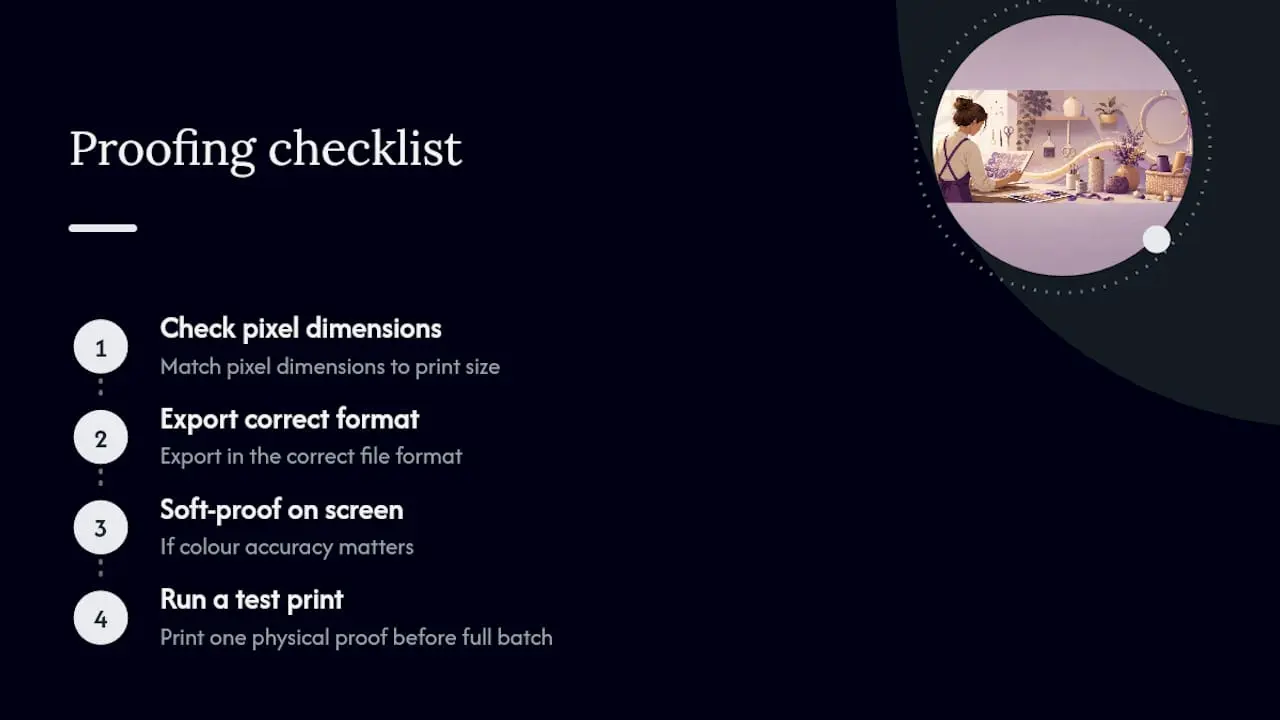
My proofing checklist stays the same regardless of project: check pixel dimensions against print size, export in the right format, soft-proof on screen if colour accuracy matters, then run one physical test print before committing to a full batch. Small-run proofs cost a few sheets of paper. Discovering a resolution problem after printing fifty finished cards costs considerably more than that.
— Rob
How Craftsuprint helps with print-ready templates
Sourcing artwork that’s already built at the correct pixel dimensions saves you the calculation work covered above. Craftsuprint’s marketplace carries ready-made card fronts, sticker sheet layouts, mini kits, and themed designs, each built by independent designers who already know what a 5×7 card or an A4 sheet needs to print cleanly.
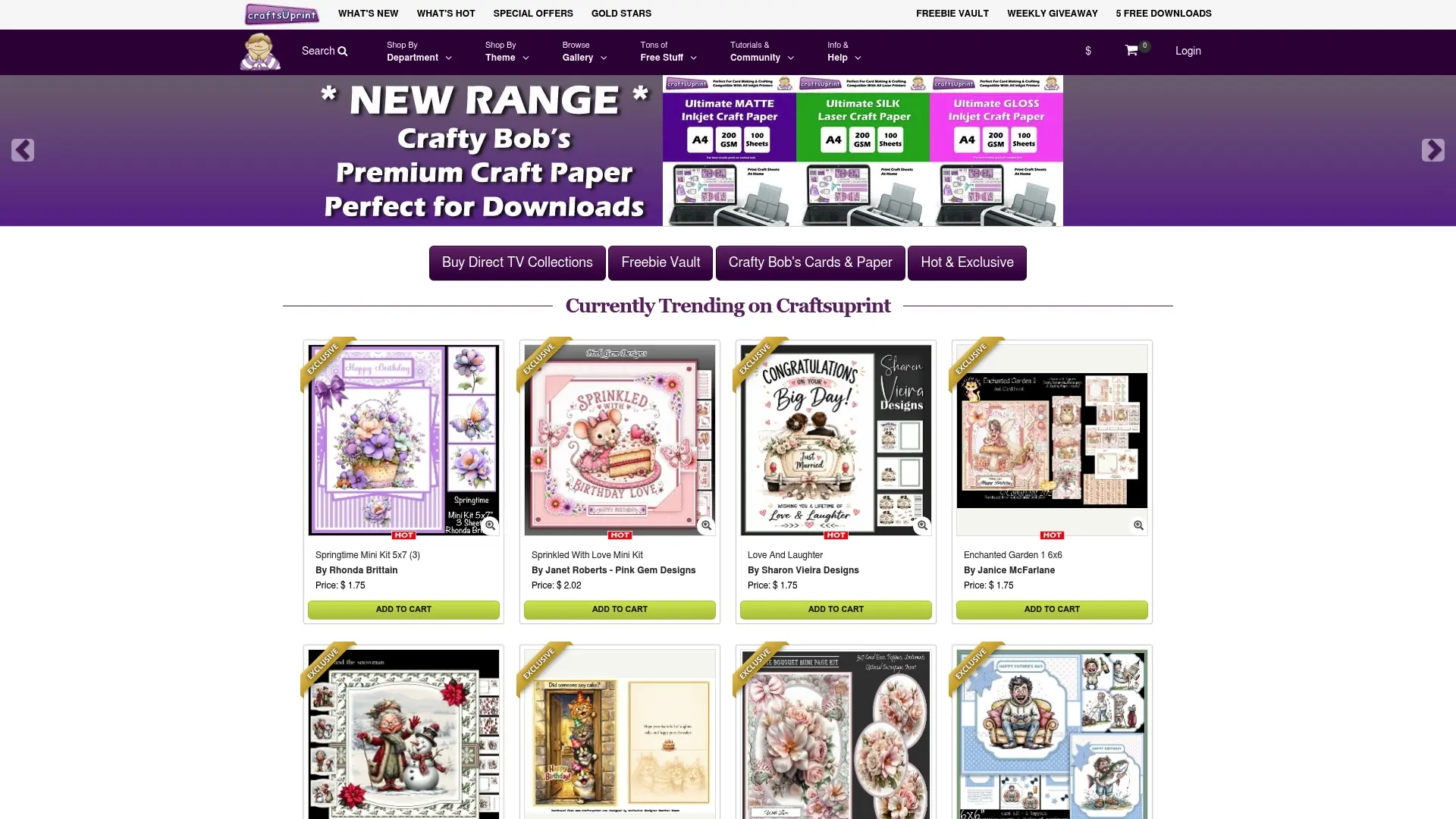
Every download comes with the resolution work done, so your job shifts from calculating pixel requirements to choosing a design and running your own quick test print, exactly the proofing step Rob recommends above. If you want to try the platform before buying anything, claim the free members’ gift and browse the downloadable template categories to see sizing and format details listed against each design. Print one at home first, check the edges and small text, then order with confidence.
Sources
- What Is DPI Resolution? DPI Explained
- Print Resolution & DPI: How Much Do You Actually Need? | PDF Press
- Resolution specs for printing images | Adobe HelpX
- High-Quality Image Printing: DPI, Resolution, and Format Guide
FAQ
Is 600 or 300 DPI better for print quality?
For handheld items like cards and stickers, 300 DPI is the accepted standard and 600 DPI rarely produces a visible improvement to the human eye at that distance. The exception is line art, QR codes, and fine text, where 600 DPI or higher genuinely sharpens edges.
Is 300 DPI better than 1200 DPI for print quality?
For photographic or full-colour designs viewed at arm’s length, 300 DPI matches the limit of human visual acuity, so 1200 DPI adds file weight without a visible benefit. 1200 DPI only earns its keep online art, barcodes, or QR codes that depend on crisp edges.
Is 400 PPI good for printing?
Yes, using more than the 300 DPI baseline for handheld printables gives a small safety margin if the print size shifts slightly. It won’t look noticeably sharper than 300 DPI to the eye, but it does nothing to harm quality either.
Is 800 or 1200 DPI better?
Neither is necessary for standard photographic or design printing, since both sit well above what’s needed for arm’s-length viewing. Reserve resolutions in that range for line art, barcodes, or fine text where crisp edges genuinely benefit from the extra pixel density.
What’s the safest way to check if my printable is print-ready?
Calculate your required pixels using print size in inches multiplied by 300 DPI, then compare that figure against your file’s actual pixel dimensions in Photoshop, Preview, or your file’s properties panel. Running one physical test print before a full batch catches any resolution problems the numbers alone might miss.