
Make 12 Printable Card Design Ideas for Crafters With Print Tips
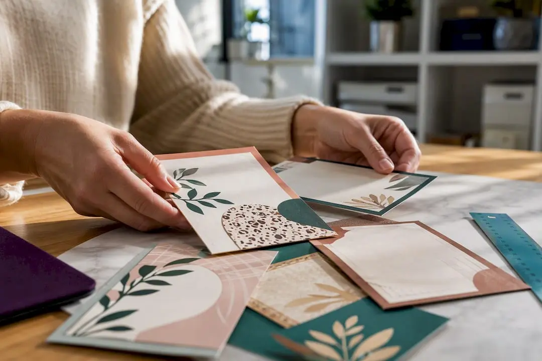
Every idea below is one you can finish in an evening: pick a layout, swap in your own photo or colours, and print it. Craftsuprint stocks downloadable templates and tutorials to get you started, and the print-ready notes further down cover bleed, DPI and paper choices so your first proof doesn’t come out blurry or off-centre.
TL;DR:
- Most home printers can produce professional-looking cards on 250 to 300gsm cardstock, but foil and embossing effects require a trade printer for best results.
- Using a layered PDF or PSD template with bleed and fold marks simplifies customization and ensures accurate trimming and layout consistency.
- Export all print files at 300 DPI with 3mm bleed and embed fonts, working in CMYK mode or converting from RGB for accurate color reproduction.
- Limiting design to one hero image, two fonts, and minimal text improves clarity and prevents clutter, which enhances the card’s professional appearance.
- Always verify licensing for images and fonts to avoid copyright issues, especially when selling printed or digital cards commercially.
Table of Contents
- Printable card design ideas worth stealing right now
- How to prepare your file for print: sizes, bleed and DPI
- Paper, finishing and home-cutting tips
- Customisation rules that keep printables looking professional
- Where to find free and customisable printable templates
- Printing tips from Craftsuprint’s own tutorials
- Legal considerations for images and fonts in printable card designs
- Why printable cards are still worth the craft time
- Craftsuprint: templates, themed packs and print-ready tutorials
- Sources
- FAQ
Printable card design ideas worth stealing right now
These are twelve layouts that consistently work, whichever occasion you’re designing for. Each one names a finished size and a single change you can make to fit your own event.
- Birthday photo collage (5×7 flat). Three or four cropped photos in a grid, one bold number for the age. Swap the photo block for a new friend and it works for any birthday going forward.
- Minimal typographic thank-you (A6 flat). Just a word, set large, on a plain or lightly textured background. Change the ink colour to match the gift-giving season rather than redesigning the layout.
- Layered botanical thank-you (folded A2). Pressed-flower style illustrations printed on a soft-touch cover stock. Swap the leaf colour palette for autumn or spring versions of the same file.
- Illustrated kid’s party card. Bright, flat-colour characters with a speech bubble for the birthday child’s name. Print on a slightly heavier stock so small hands don’t crease it instantly.
- Wedding save-the-date (5×7 flat). Clean serif type, a single venue photo or illustration, and a QR code linking to the couple’s details. Swap the accent colour to match the wedding palette.
- New-baby announcement with photo frame. A simple oval or rounded frame holding the newborn photo, name and weight printed below. Change the frame colour for a boy, girl or neutral announcement.
- Sympathy card, minimal condolence design. A single muted illustration (a branch, a candle) with generous white space. Keep the palette restrained; this is the one occasion where less genuinely is more.
- Congratulations card with a foil-accent mock-up. Design the foil element as a separate spot-colour layer; true foil finishing needs a trade printer, so treat the mock-up as your artwork guide.
- Interactive pocket card. A die-cut pocket holding a smaller printed note or gift voucher gives real presence when opened, and it’s easier to construct than it looks with a layered printable insert.
- Gift voucher with matching tag. Print the voucher and a coordinating gift tag from the same colour file so they read as a set.
- Seasonal greetings for Christmas. A folded A2 card with a snow-scene illustration works for years if you print the greeting separately, so you can update the year without redoing the artwork.
- Handmade-look collage with patterned paper. Layer digital patterned-paper scans behind a simple die-cut shape to mimic traditional paper-craft texture without the scissors.
Pro Tip: Design one “master” layout per occasion type, then build a simple colour-swap version rather than starting from scratch each time; it’s the fastest way to build a personal library of custom card templates.
How to prepare your file for print: sizes, bleed and DPI
Folded A2 cards finish at a size suitable for common envelopes; unfold the design and you’re working on a flat spread large enough for front and inside panels laid out side by side. A 5×7 flat card stays exactly that size with no fold to account for. Get the panel arrangement wrong and you’ll print the greeting upside down inside the fold, which is the single most common mistake first-timers make.
Before exporting, run through this:
- Export at 300 DPI minimum, every time, regardless of finished size.
- Add 3mm of bleed on all sides so trimming doesn’t leave a white sliver at the edge.
- Embed all fonts in the PDF rather than relying on the printer having them installed.
- Work in CMYK where your software allows it, or let the print shop convert from RGB.
- Add crop marks if your printer supports them, and mark score lines separately on anything above 250gsm.
Designing all four panels (front, inside left, inside right, back) as one coordinated spread before you export avoids the classic layout mistake of running out of room for a handwritten message, a point greeting card design guides make repeatedly. The same 300 DPI, bleed and colour-mode discipline that applies to business card pre-press translates directly to greeting cards.
Paper, finishing and home-cutting tips
Stock choice does more for perceived quality than almost any design decision. An uncoated interior takes pen ink cleanly, while a coated or soft-touch cover gives the front panel some shine and resistance to fingerprints. For anything you’d call a keepsake, jump to 300gsm or heavier; anything lighter feels flimsy the moment it’s picked up.
- A basic guillotine gives straighter edges than scissors on repeat cuts.
- A scoring board prevents cracking when you fold anything over 250gsm.
- A corner rounder is a small, cheap upgrade that instantly looks more finished.
- Send jobs needing foil, embossing or letterpress to a trade printer rather than faking it at home.
- Score before you fold, never after, on heavy stock.
For small batches, a good inkjet or laser printer on 250 to 300gsm stock is genuinely cost-effective and perfectly capable of producing cards that don’t look homemade in the wrong way. A modest toolkit like this, built up gradually, is what actually separates “handmade” from “handmade professional” more than any single design trick. There’s more on embellishment techniques in this guide to boosting handmade cards.
Customisation rules that keep printables looking professional
Good card design leans on restraint more than decoration. A clear modular layout with consistent spacing reads better and looks more deliberate than one crammed with extra elements, and that’s true whether you’re designing a UI card or a paper one.
- Pick one hero image or illustration for the cover; resist adding a second.
- Limit yourself to two fonts across the whole card, one for headlines and one for body text.
- Keep cover copy to five to seven words; save longer sentiments for the inside, where readers expect the fuller message.
- Build hierarchy through size and spacing, not extra typefaces. Aim for spacing increments around 8 to 12 pixels when translating a digital grid to a print layout.
- Check text contrast against the background before you print. What looks fine on a bright screen sometimes turns illegible on matte paper.
- Crop photos to the actual focal point rather than shrinking the whole frame, and keep source images high resolution; a stretched low-res photo is the fastest way to make a card look cheap.
Pro Tip: If a layout feels busy, delete one element before you add anything new. Cards fail on clutter far more often than they fail on being too plain.
Where to find free and customisable printable templates
Three sources cover most of what hobby crafters need. Instant-download marketplace packs, like those on Craftsuprint, come print-ready with layered files you can drop your own photo or text into. Independent designer freebies, often shared through blogs or newsletters, tend to be simpler but useful for testing a layout before committing to a paid pack. Community-shared packs from craft forums vary wildly in quality, so check them carefully before printing a full run.
Before downloading anything, check:
- File type: a layered PDF or PSD beats a flattened JPEG for genuine customisation.
- Bleed and fold marks included, not just a plain square canvas.
- Licence terms: personal use only, or cleared for cards you intend to sell.
- Completeness: inside panels, a back panel, and ideally a matching envelope size.
Once you’ve picked one, the workflow is simple: customise the text and photo, export following the DPI and bleed rules above, then run a single proof print before committing to a full batch.
Printing tips from Craftsuprint’s own tutorials
A few printer settings solve most home-printing headaches before they start. Set the media type to match your stock (cardstock, not plain paper), choose the manual or heavy-paper feed tray where your printer has one, and run in the highest quality mode for anything with fine text or photos. Always print one proof sheet before committing to a full run.
- If print sits slightly off-centre, check the paper guides are flush before reprinting.
- Feed one sheet of cardstock at a time to stop double feeds jamming the tray.
- Let ink dry fully before stacking finished cards to avoid smudging.
- Score heavy stock before folding; an uncoated interior takes pen and ink far better than coated stock.
- Save foil, embossing or spot-UV effects for a trade printer rather than forcing them at home.
This step-by-step printable card tutorial walks through the whole process from template to finished proof, and the paper craft skills guide covers scoring and cutting in more depth.
Legal considerations for images and fonts in printable card designs
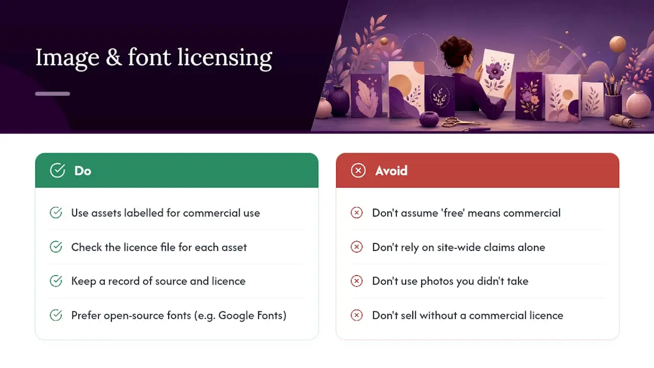
Using a photo or font you found online without checking its licence is the single most common way a printable card project runs into trouble. Stock photography sites licence images for personal use, commercial use, or both, and those terms differ per site. If you plan to sell a card you’ve designed, whether as a physical print or a digital download, you need a licence that explicitly covers commercial resale, not just personal printing.
Fonts follow the same logic. A font that’s free for personal projects may require a separate commercial licence the moment you sell what you’ve made with it, even if it’s just one card at a craft fair. Google Fonts and similarly licensed open-source fonts tend to be safe for both personal and commercial use, but always check the specific licence file rather than assuming.
Copyright on a photo generally belongs to whoever took it, not whoever posted it online, so a family photo you didn’t take yourself needs permission before it goes on a printable card meant for wider distribution. If you’re designing templates to sell on a marketplace, this matters even more: buyers expect the assets to be cleared, and a licensing mistake can affect every copy sold, not just one card.
When in doubt, use assets explicitly marked for commercial use, keep a record of where each image and font came from, and treat “free” downloads with the same scrutiny you’d give a paid one.
Why printable cards are still worth the craft time
A printed card someone keeps on their mantelpiece beats a text message every time, and the barrier to making one well has never been lower. Pick one idea from this list, print a single proof today, and adjust from there. The second attempt is always better than the first.
— Rob
Craftsuprint: templates, themed packs and print-ready tutorials
If everything above sounds useful but you’d rather start from a finished layout than a blank page, that’s exactly what Craftsuprint is built for. The site runs downloadable card making kits, themed template packs and step-by-step tutorials covering the print-ready basics: bleed, DPI, scoring and paper choice, all written for hobby crafters rather than professional print studios.
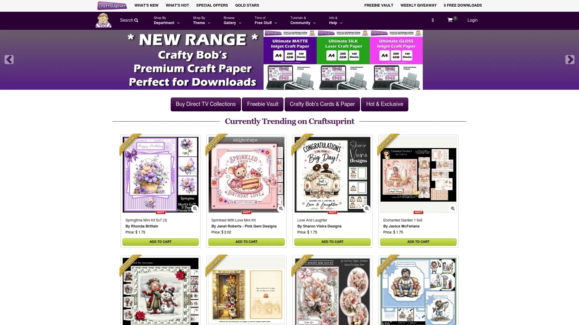
Printable packs are offered alongside themed collections, featuring styles from minimal typography to detailed layered scenes, all sized and structured for straightforward home printing. New crafters can start with the free members gift to see how a finished download is put together before browsing the full range of card templates by theme and occasion. Pick a pack, download it, and print your first proof this evening.
Sources
- UI card design: anatomy and best practices
- Greeting card design: how to design cards
- How to design a business card: a step-by-step guide (2026)
FAQ
Where can I print a free card template?
Home inkjet or laser printers handle most free templates well on 250 to 300gsm cardstock; for higher-volume or special finishes like foil, a local trade print shop or online print service is the better route.
How do I print my own card design?
Export your finished file at 300 DPI with 3mm bleed, load matching cardstock into your printer’s heavy-paper tray, select the correct media type in the print settings, and run one proof sheet before printing a full batch.
Where can I find free printable templates?
Marketplace sites such as Craftsuprint list free and paid downloadable templates alongside independent designer freebies and community-shared packs; always check the licence before printing for anything beyond personal use.
Where can I find free layouts for making cards?
Look for layered PDF or PSD layouts that already include bleed and fold marks rather than a flat, uneditable image; these give you far more control when swapping in your own text and photos.